Linear Regression
Determine which explanatory variables have a significant effect on the mean of the quantitative response variable.
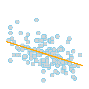
Simple Linear Regression
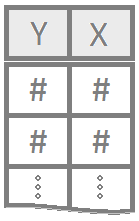
Simple linear regression is a good analysis technique when the data consists of a single quantitative response variable \(Y\) and a single quantitative explanatory variable \(X\).
Overview
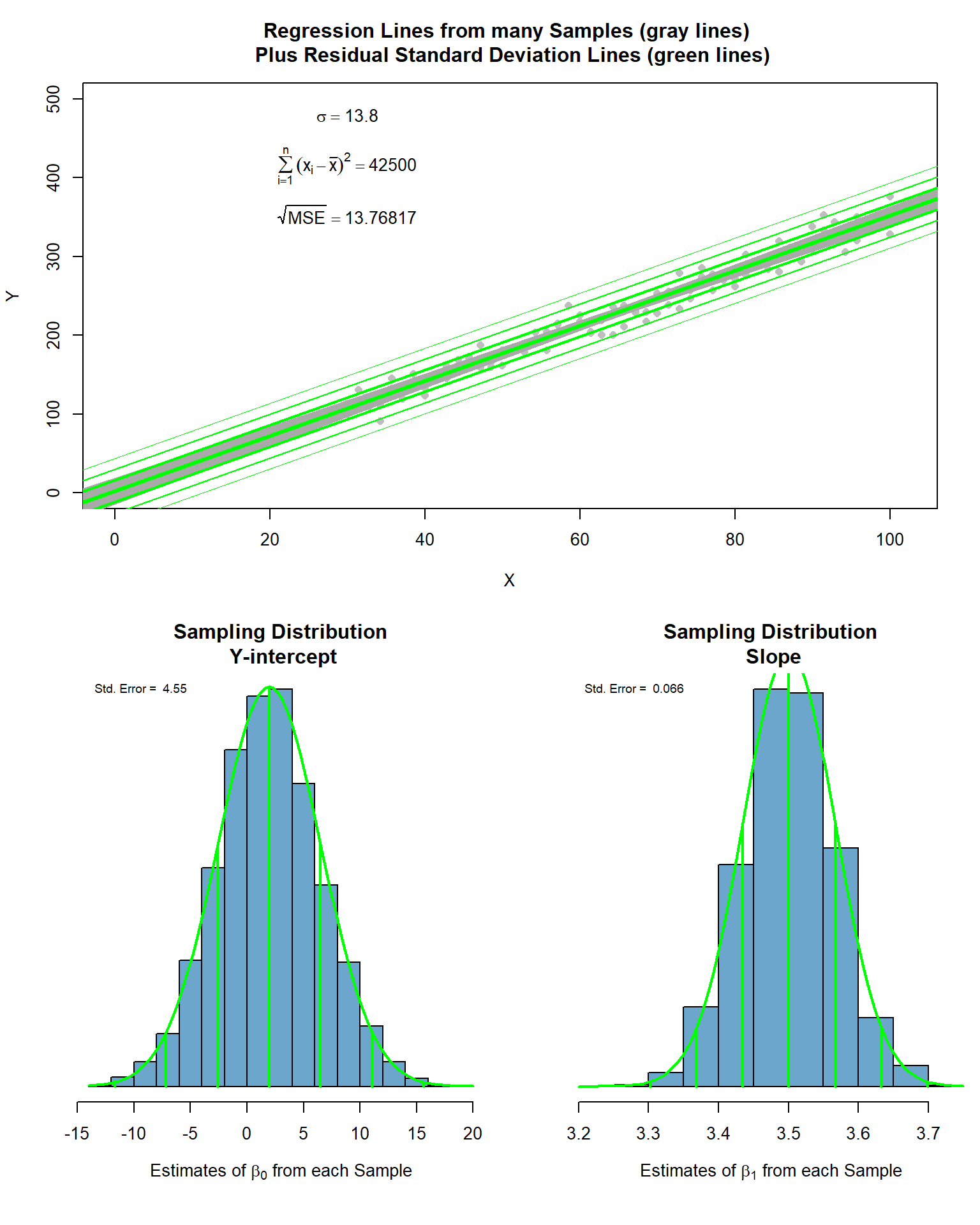
Mathematical Model
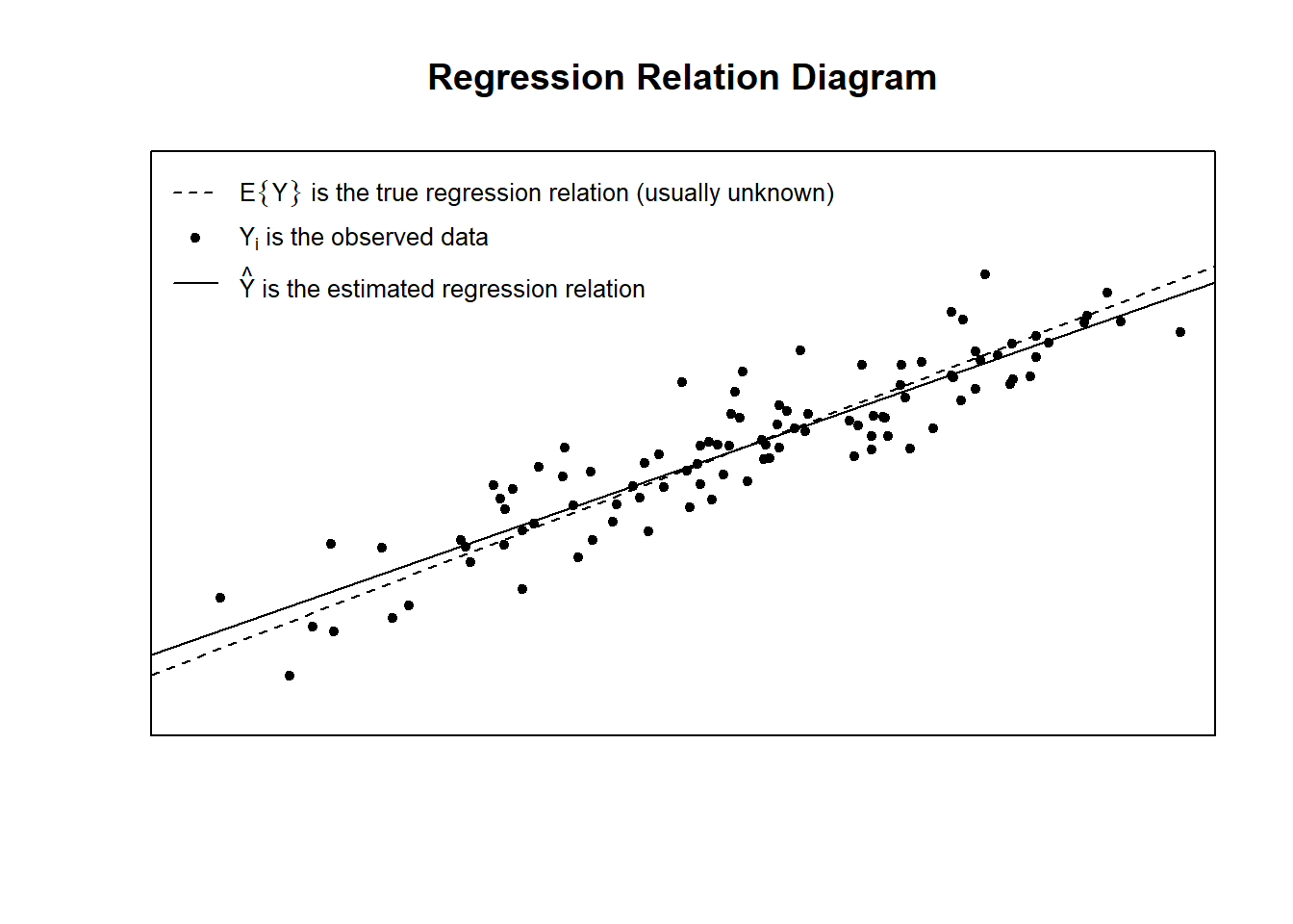
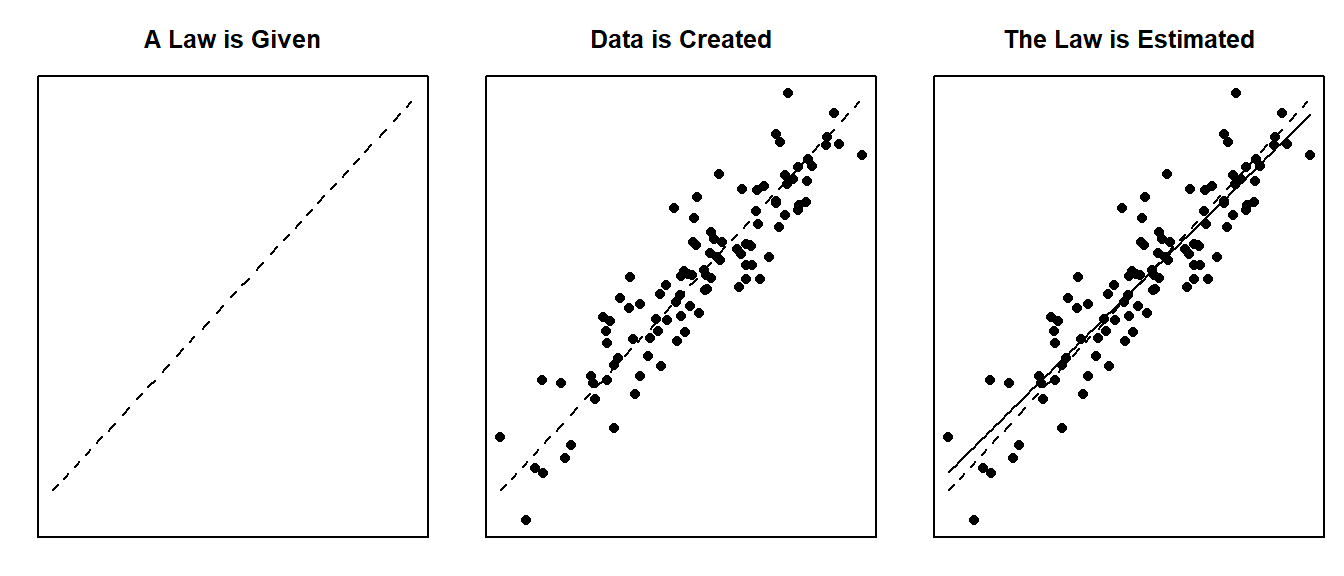
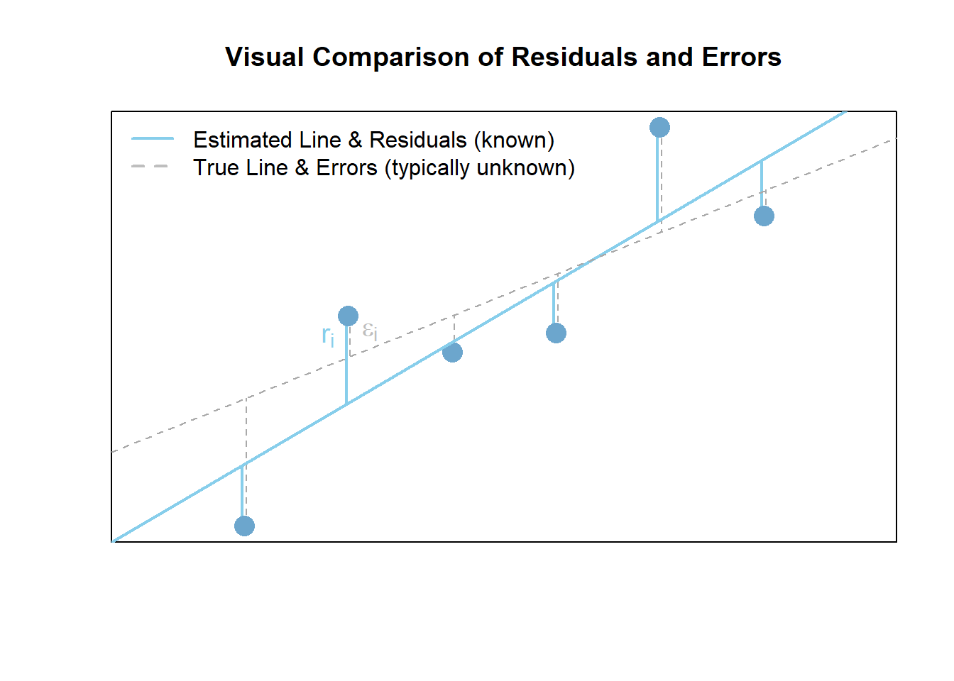
The true regression model assumed by a regression analysis is given by
The estimated regression line obtained from a regression analysis, pronounced “y-hat”, is written as
Note: see the Explanation tab The Mathematical Model for details about these equations.
Hypotheses
\[ \left.\begin{array}{ll} H_0: \beta_1 = 0 \\ H_a: \beta_1 \neq 0 \end{array} \right\} \ \text{Slope Hypotheses}^{\quad \text{(most common)}}\quad\quad \]
\[ \left.\begin{array}{ll} H_0: \beta_0 = 0 \\ H_a: \beta_0 \neq 0 \end{array} \right\} \ \text{Intercept Hypotheses}^{\quad\text{(sometimes useful)}} \]
If \(\beta_1 = 0\), then the model reduces to \(Y_i = \beta_0 + \epsilon_i\), which is a flat line. This means \(X\) does not improve our understanding of the mean of \(Y\) if the null hypothesis is true.
If \(\beta_0 = 0\), then the model reduces to \(Y_i = \beta_1 X + \epsilon_i\), a line going through the origin. This means the average \(Y\)-value is \(0\) when \(X=0\) if the null hypothesis is true.
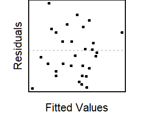
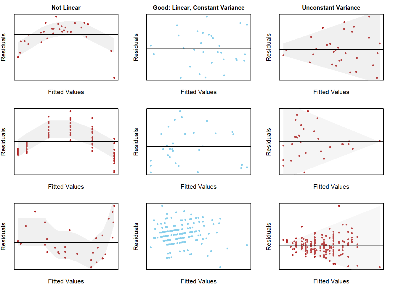
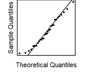
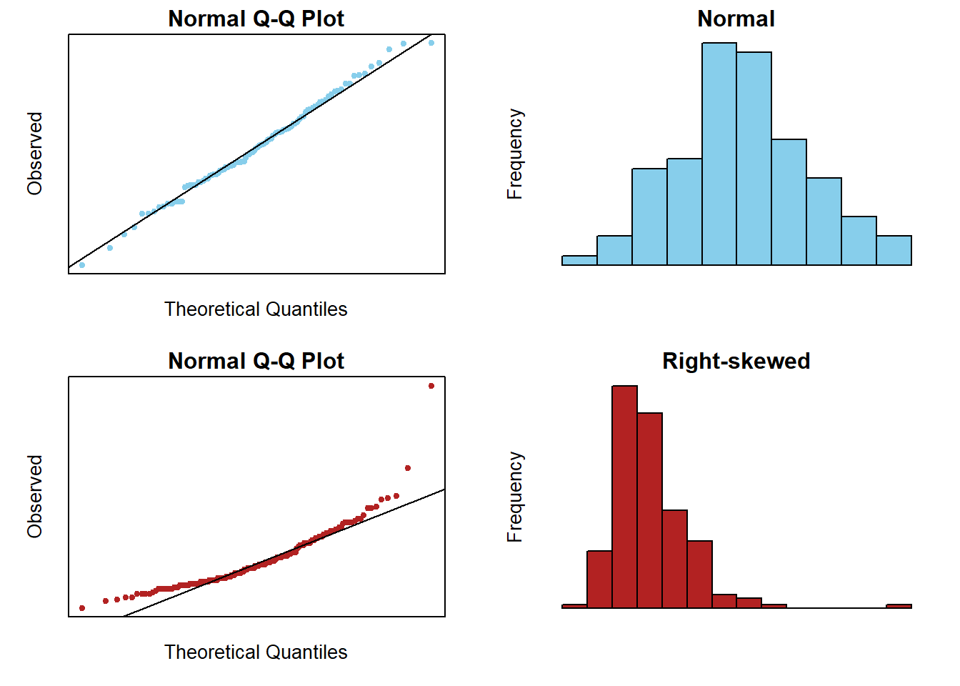
Assumptions
This regression model is appropriate for the data when five assumptions can be made.
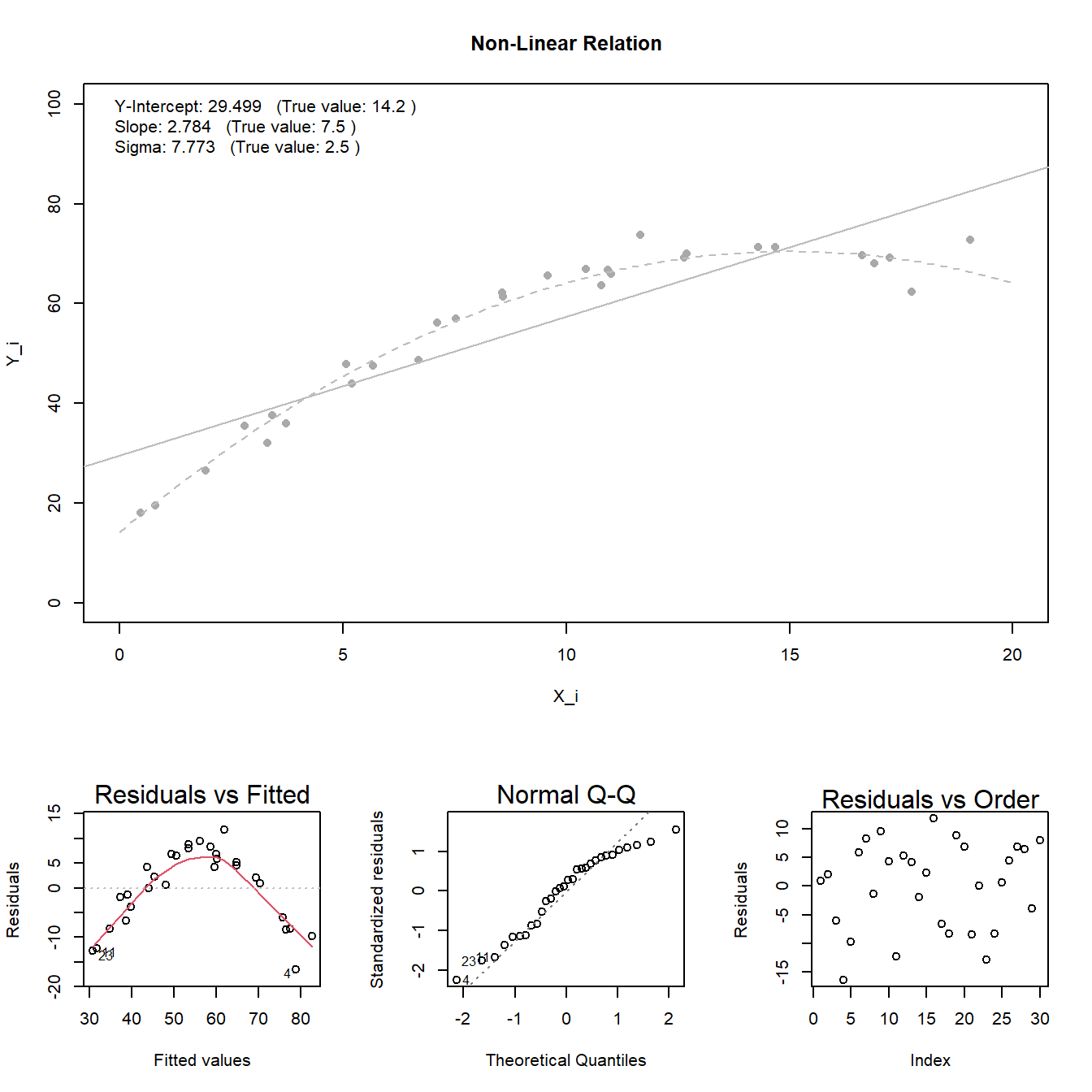
Linear Relation: the true regression relation between \(Y\) and \(X\) is linear.
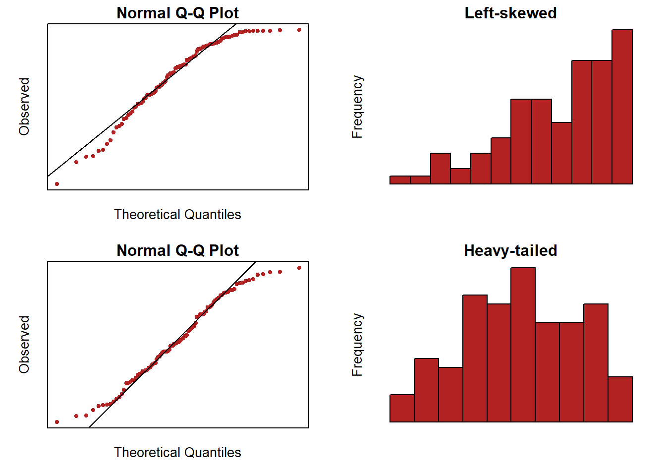
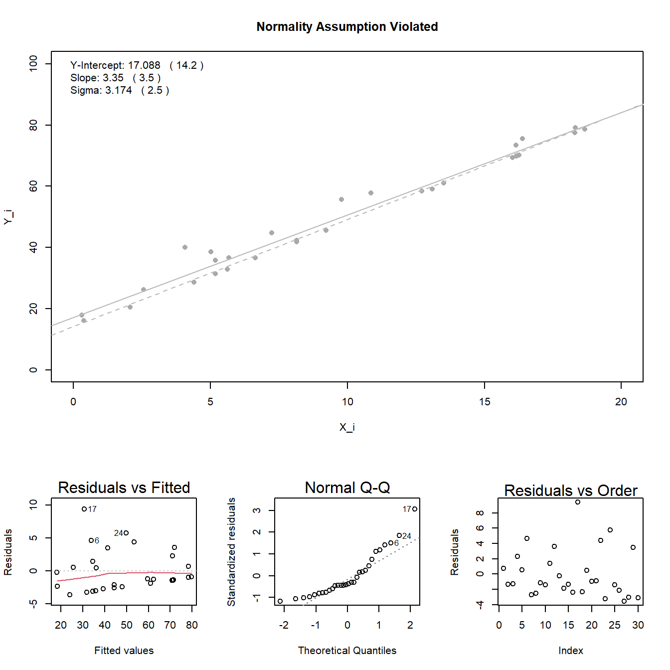
Normal Errors: the error terms \(\epsilon_i\) are normally distributed with a mean of zero.
Constant Variance: the variance \(\sigma^2\) of the error terms is constant (the same) over all \(X_i\) values.
Fixed X: the \(X_i\) values can be considered fixed and measured without error.
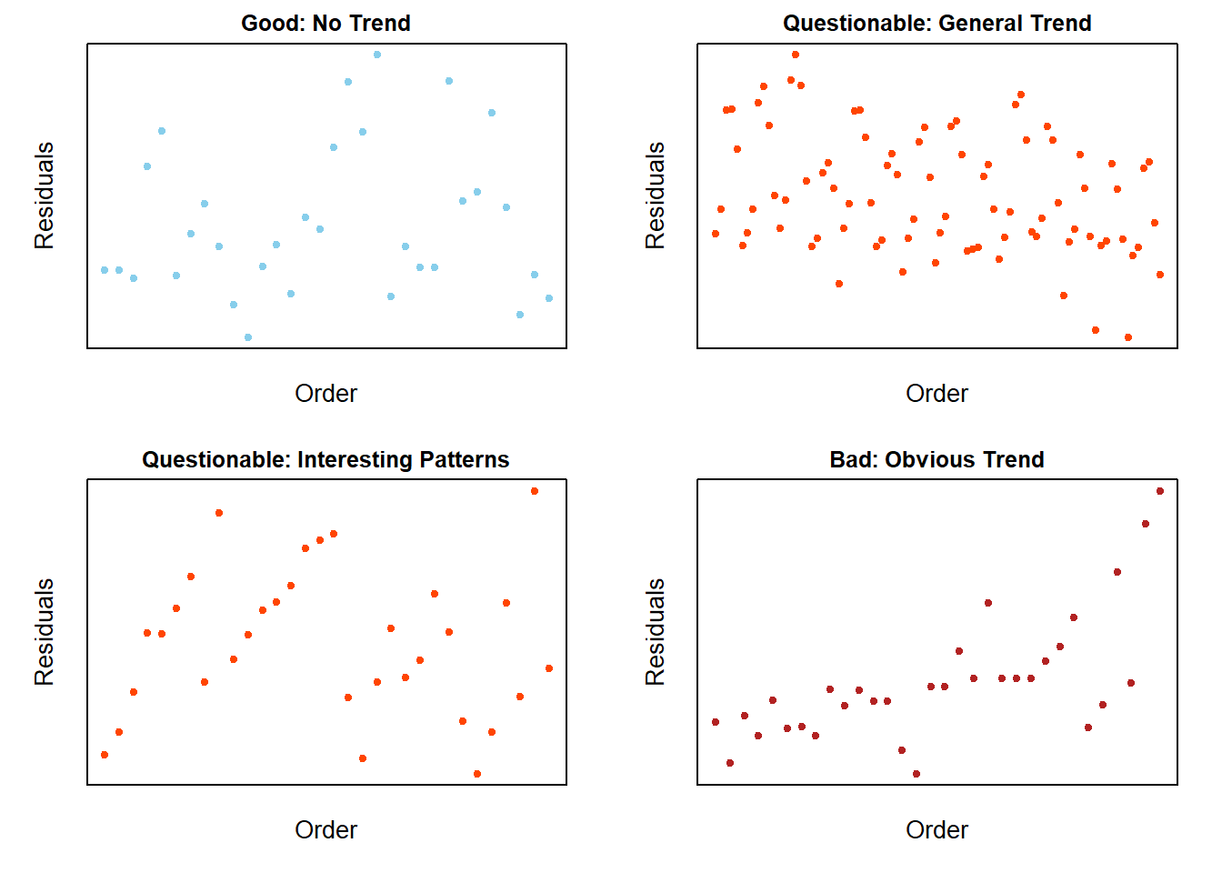
Independent Errors: the error terms \(\epsilon_i\) are independent.
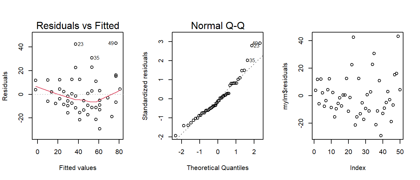
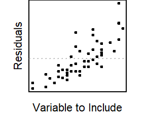
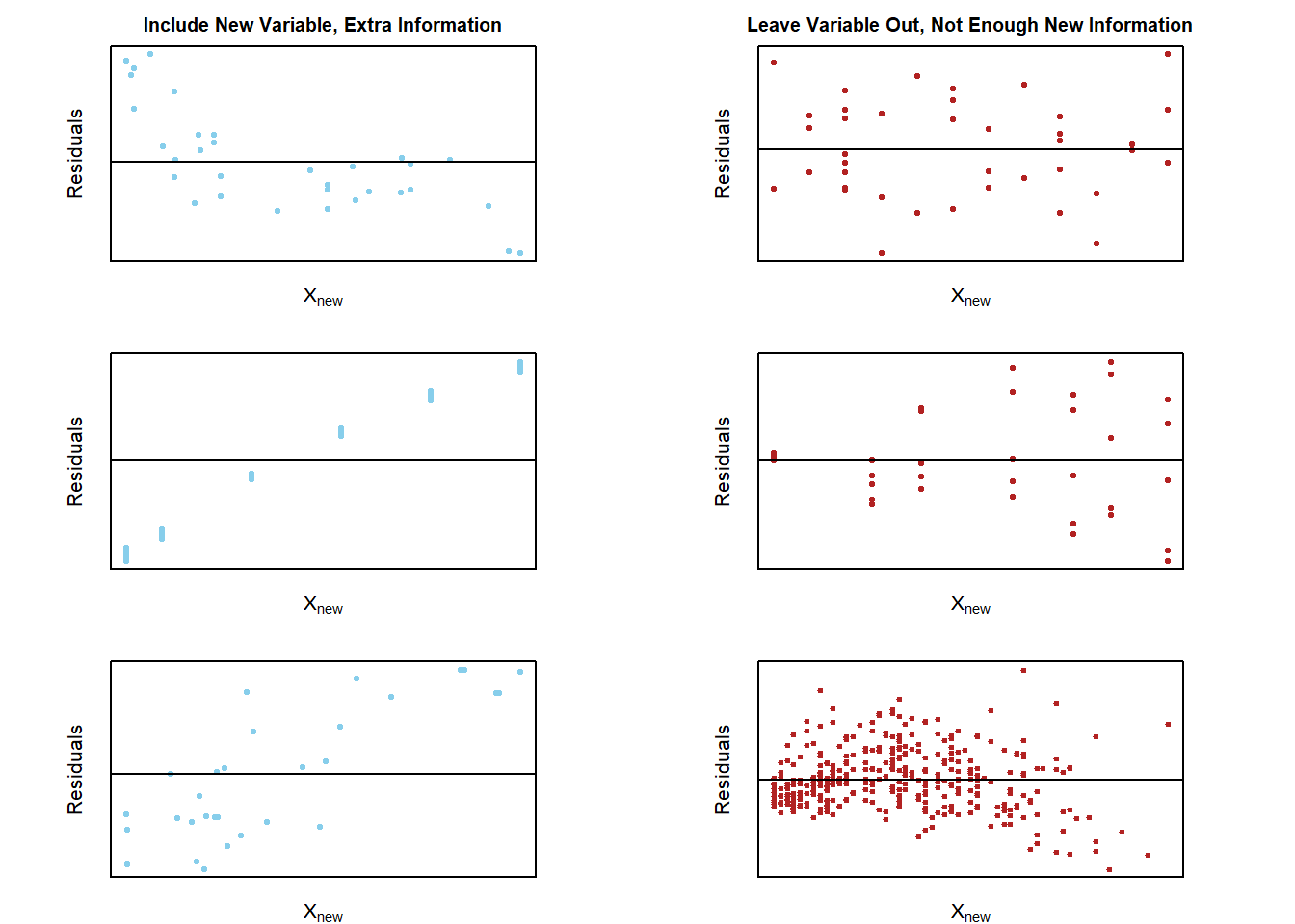
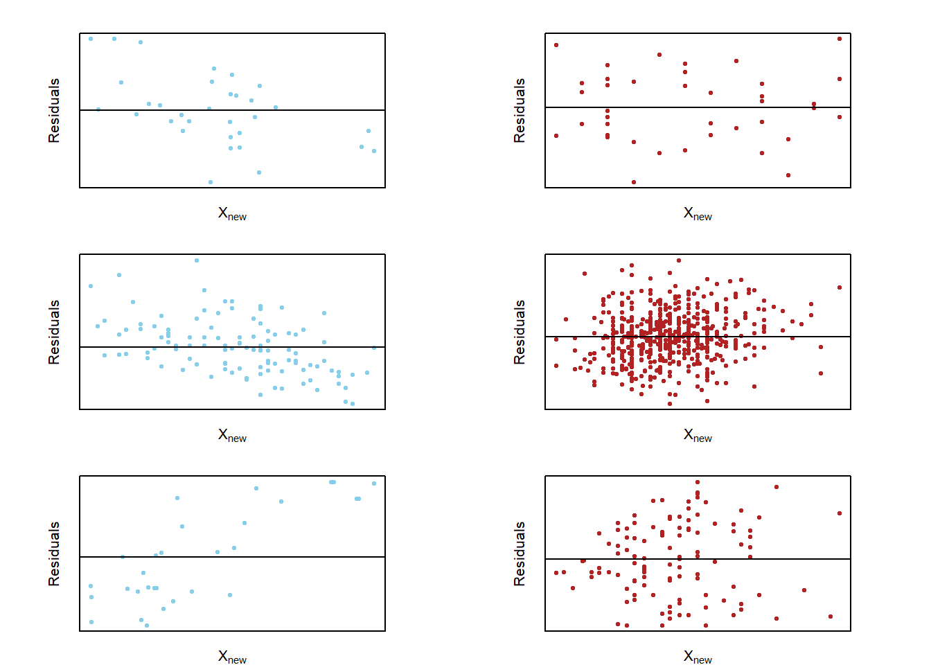
Note: see the Explanation tab Residual Plots & Regression Assumptions for details about checking the regression assumptions.
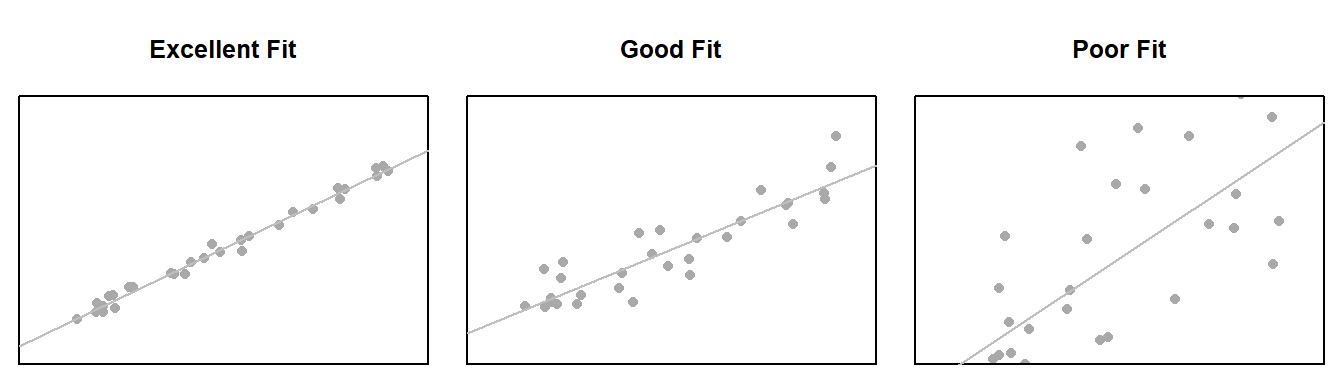
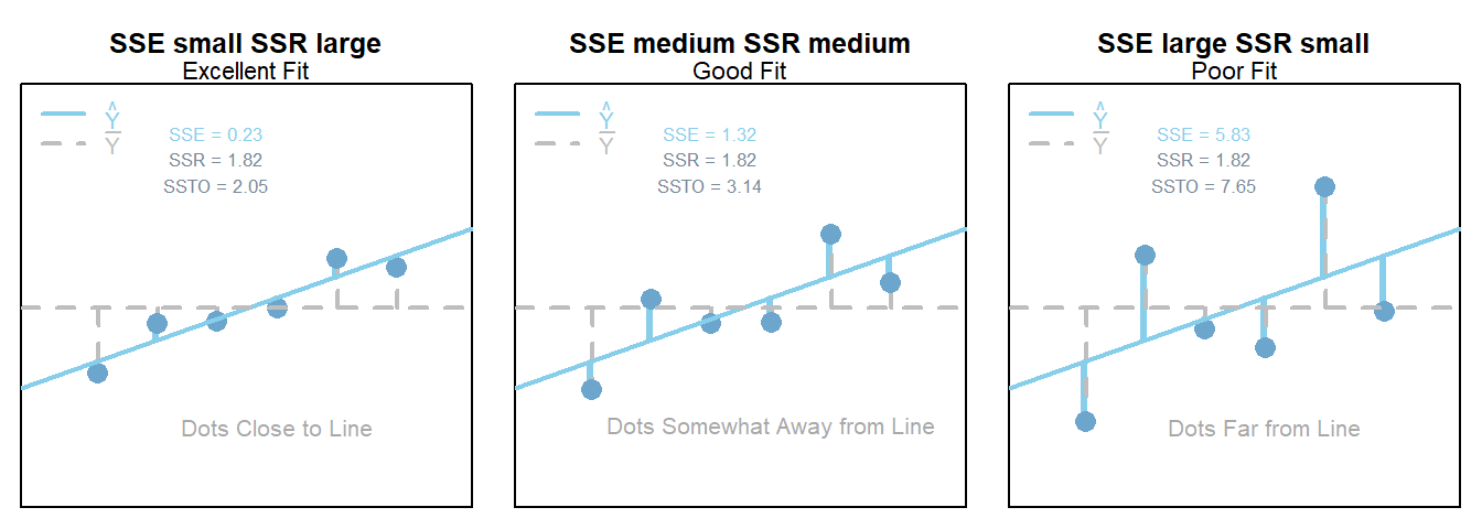
Interpretation
The slope is interpreted as, “the change in the average y-value for a one unit change in the x-value.” It is not the average change in y. It is the change in the average y-value.
The y-intercept is interpreted as, “the average y-value when x is zero.” It is often not meaningful, but is sometimes useful. It just depends if x being zero is meaningful or not within the context of your analysis. For example, knowing the average price of a car with zero miles is useful. However, pretending to know the average height of adult males that weigh zero pounds, is not useful.
R Instructions
Console Help Command: ?lm()
Perform the Regression
mylm This is some name you come up with that will become the R object that stores the results of your linear regression lm(...) command. <- This is the “left arrow” assignment operator that stores the results of your lm() code into mylm name. lm( lm(…) is an R function that stands for “Linear Model”. It performs a linear regression analysis for Y ~ X. Y Y is your quantitative response variable. It is the name of one of the columns in your data set. ~ The tilde symbol ~ is used to tell R that Y should be treated as the response variable that is being explained by the explanatory variable X. X, X is the quantitative explanatory variable (at least it is typically quantitative but could be qualitative) that will be used to explain the average Y-value. data = NameOfYourDataset NameOfYourDataset is the name of the dataset that contains Y and X. In other words, one column of your dataset would be your response variable Y and another column would be your explanatory variable X. ) Closing parenthesis for the lm(…) function.
summary(mylm) The summary command allows you to print the results of your linear regression that were previously saved in mylm name. Click to Show Output Click to View Output.
Check Assumptions 1, 2, 3, and 5
par( The par(…) command stands for “Graphical PARameters”. It allows you to control various aspects of graphics in Base R. mfrow= This stands for “multiple frames filled by row”, which means, put lots of plots on the same row, starting with the plot on the left, then working towards the right as more plots are created. c( The combine function c(…) is used to specify how many rows and columns of graphics should be placed together. 1, This specifies that 1 row of graphics should be produced. 3 This states that 3 columns of graphics should be produced. ) Closing parenthesis for c(…) function. ) Closing parenthesis for par(…) function.
plot( This version of plot(…) will actually create several regression diagnostic plots by default. mylm, This is the name of an lm object that you created previously. which= This allows you to select “which” regression diagnostic plots should be drawn. 1 Selecting 1, would give the residuals vs. fitted values plot only. : The colon allows you to select more than just one plot. 2 Selecting 2 also gives the Q-Q Plot of residuals. If you wanted to instead you could just use which=1 to get the residuals vs fitted values plot, then you could use qqPlot(mylm$residuals) to create a fancier Q-Q Plot of the residuals. ) Closing parenthesis for plot(…) function.
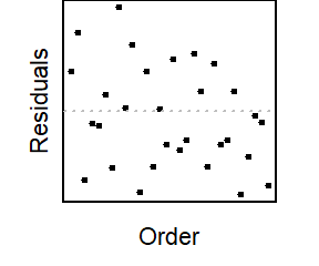
plot( This version of plot(…) will be used to create a time-ordered plot of the residuals. The order of the residuals is the original order of the x-values in the original data set. If the original data set doesn’t have an order, then this plot is not interesting. mylm The lm object that you created previously. $ This allows you to access various elements from the regression that was performed. residuals This grabs the residuals for each observation in the regression. ) Closing parenthesis for plot(…) function. Click to Show Output Click to View Output.
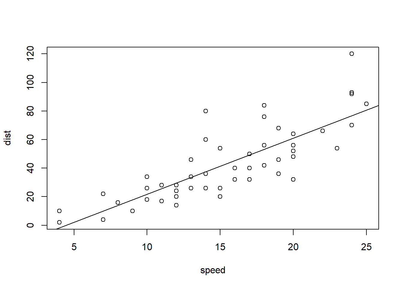
Plotting the Regression Line
To add the regression line to a scatterplot use the abline(...) command:
plot( The plot(…) function is used to create a scatterplot with a y-axis (the vertical axis) and an x-axis (the horizontal axis). Y This is the “response variable” of your regression. The thing you are interested in predicting. This is the name of a “numeric” column of data from the data set called YourDataSet. ~ The tilde “~” is used to relate Y to X and can be found on the top-left key of your keyboard. X, This is the explanatory variable of your regression. It is the name of a “numeric” column of data from YourDataSet. . data= The data= statement is used to specify the name of the data set where the columns of “X” and “Y” are located. YourDataSet This is the name of your data set, like KidsFeet or cars or airquality. ) Closing parenthesis for plot(…) function.
abline( This stands for “a” (intercept) “b” (slope) line. It is a function that allows you to add a line to a plot by specifying just the intercept and slope of the line. mylm This is the name of an lm(…) that you created previoiusly. Since mylm contains the slope and intercept of the estimated line, the abline(…) function will locate these two values from within mylm and use them to add a line to your current plot(…). ) Closing parenthesis for abline(…) function. Click to Show Output Click to View Output.
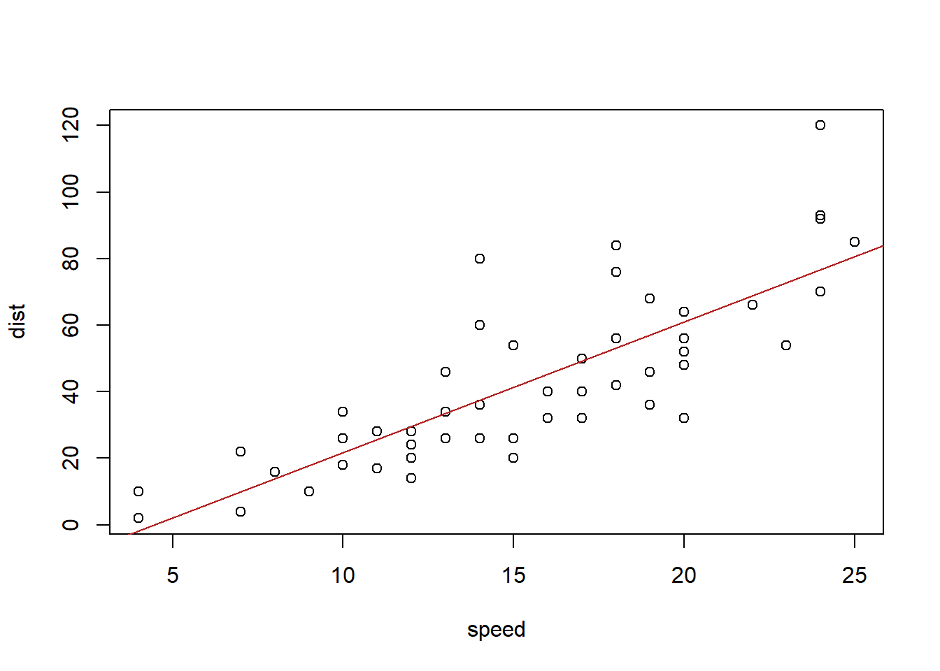
You can customize the look of the regression line with
abline( This stands for “a” (intercept) “b” (slope) line. It is a function that allows you to add a line to a plot by specifying just the intercept and slope of the line. mylm, This is the name of an lm(…) that you created previoiusly. Since mylm contains the slope and intercept of the estimated line, the abline(…) function will locate these two values from within mylm and use them to add a line to your current plot(…). lty= The lty= stands for “line type” and allows you to select between 0=blank, 1=solid (default), 2=dashed, 3=dotted, 4=dotdash, 5=longdash, 6=twodash. 1, This creates a solid line. Remember, other options include: 0=blank, 1=solid (default), 2=dashed, 3=dotted, 4=dotdash, 5=longdash, 6=twodash. lwd= The lwd= allows you to specify the width of the line. The default width is 1. Using lwd=2 would double the thickness, and so on. Any positive value is allowed. 1, Default line width. To make a thicker line, us 2 or 3… To make a thinner line, try 0.5, but 1 is already pretty thin. col= This allows you to specify the color of the line using either a name of a color or rgb(.5,.2,.3,.2) where the format is rgb(percentage red, percentage green, percentage blue, percent opaque). “someColor” Type colors() in R for options. ) Closing parenthesis for abline(…) function. Click to Show Output Click to View Output.
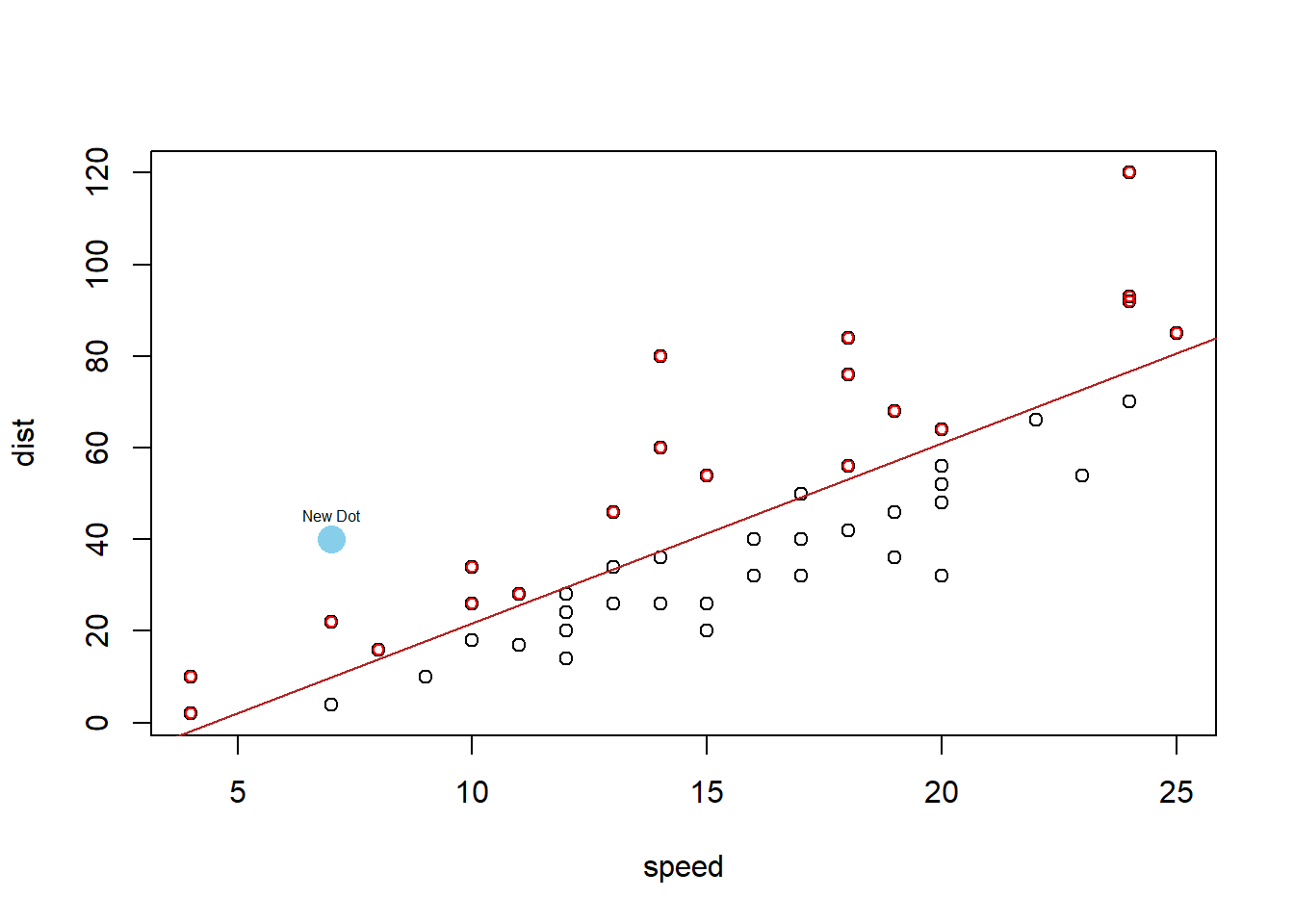
You can add points to the regression with…
points( This is like plot(…) but adds points to the current plot(…) instead of creating a new plot. newY newY should be a column of values from some data set. Or, use points(newX, newY) to add a single point to a graph. ~ This links Y to X in the plot. newX, newX should be a column of values from some data set. It should be the same length as newY. If just a single value, use points(newX, newY) instead. data=YourDataSet, If newY and newX come from a dataset, then use data= to tell the points(…) function what data set they come from. If newY and newX are just single values, then data= is not needed. col=“skyblue”, This allows you to specify the color of the points using either a name of a color or rgb(.5,.2,.3,.2) where the format is rgb(percentage red, percentage green, percentage blue, percent opaque). pch=16 This allows you to specify the type of plotting symbol to be used for the points. Type ?pch and scroll half way down in the help file that appears to learn about other possible symbols. ) Closing parenthesis for points(…) function. Click to Show Output Click to View Output.
To add the regression line to a scatterplot using the ggplot2 approach, first ensure:
library(ggplot2) or library(tidyverse)
is loaded. Then, use the geom_smooth(method = lm) command:
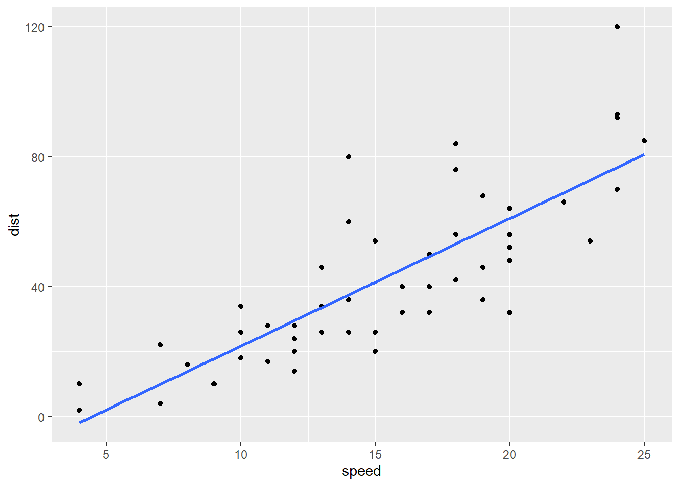
ggplot( Every ggplot2 graphic begins with the ggplot() command, which creates a framework, or coordinate system, that you can add layers to. Without adding any layers, ggplot() produces a blank graphic. YourDataSet, This is simply the name of your data set, like KidsFeet or starwars. aes( aes stands for aesthetic. Inside of aes(), you place elements that you want to map to the coordinate system, like x and y variables. x = “x = ” declares which variable will become the x-axis of the graphic, your explanatory variable. Both “x= ” and “y= ” are optional phrasesin the ggplot2 syntax. X, This is the explanatory variable of the regression: the variable used to explain the mean of y. It is the name of the “numeric” column of YourDataSet. y = “y= ” declares which variable will become the y-axis of the graphic. Y This is the response variable of the regression: the variable that you are interested in predicting. It is the name of a “numeric” column of YourDataSet. ) Closing parenthesis for aes(…) function. ) Closing parenthesis for ggplot(…) function. + The + allows you to add more layers to the framework provided by ggplot(). In this case, you use + to add a geom_point() layer on the next line.
geom_point() geom_point() allows you to add a layer of points, a scatterplot, over the ggplot() framework. The x and y coordinates are received from the previously specified x and y variables declared in the ggplot() aesthetic. + Here the + is used to add yet another layer to ggplot().
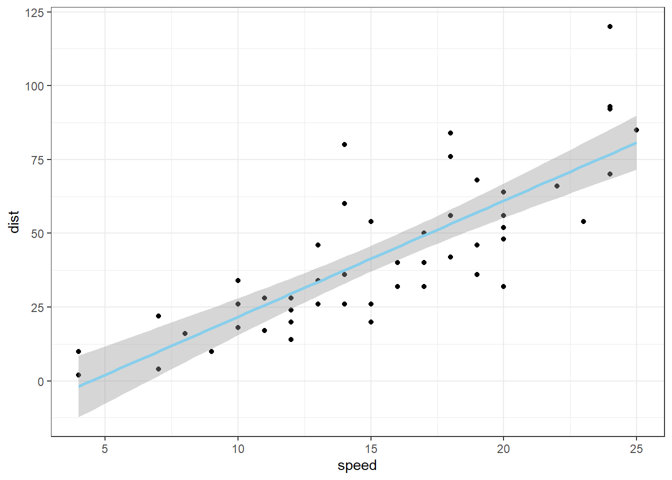
geom_smooth( geom_smooth() is a smoothing function that you can use to add different lines or curves to ggplot(). In this case, you will use it to add the least-squares regression line to the scatterplot. method = Use “method = ” to tell geom_smooth() that you are going to declare a specific smoothing function, or method, to alter the line or curve.. “lm”, lm stands for linear model. Using method = “lm” tells geom_smooth() to fit a least-squares regression line onto the graphic. The regression line is modeled using y ~ x, which variables were declared in the initial ggplot() aesthetic. There are several other methods that could be used here. se = FALSE se stands for “standard error”. Specifying FALSE turns this feature off. When TRUE, a gray band showing the “confidence band” for the regression is shown. Unless you know how to interpret this confidence band, leave it turned off. ) Closing parenthesis for the geom_smooth() function. Click to Show Output Click to View Output.
There are a number of ways to customize the appearance of the regression line:
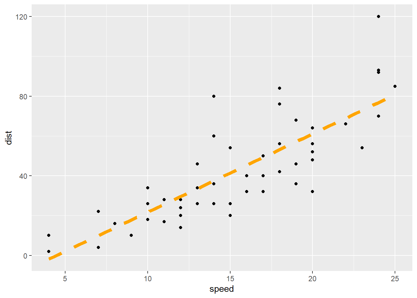
ggplot( Every ggplot2 graphic begins with the ggplot() command, which creates a framework, or coordinate system, that you can add layers to. Without adding any layers, ggplot() produces a blank graphic. cars, This is simply the name of your data set, like KidsFeet or starwars. aes( aes stands for aesthetic. Inside of aes(), you place elements that you want to map to the coordinate system, like x and y variables. x = “x = ” declares which variable will become the x-axis of the graphic, your explanatory variable. Both “x= ” and “y= ” are optional phrasesin the ggplot2 syntax. speed, This is the explanatory variable of the regression: the variable used to explain the mean of y. It is the name of the “numeric” column of YourDataSet. y = “y= ” declares which variable will become the y-axis of the grpahic. dist This is the response variable of the regression: the variable that you are interested in predicting. It is the name of a “numeric” column of YourDataSet. ) Closing parenthesis for aes(…) function. ) Closing parenthesis for ggplot(…) function. + The + allows you to add more layers to the framework provided by ggplot(). In this case, you use + to add a geom_point() layer on the next line.
geom_point() geom_point() allows you to add a layer of points, a scatterplot, over the ggplot() framework. The x and y coordinates are received from the previously specified x and y variables declared in the ggplot() aesthetic. + Here the + is used to add yet another layer to ggplot().
geom_smooth( geom_smooth() is a smoothing function that you can use to add different lines or curves to ggplot(). In this case, you will use it to add the least-squares regression line to the scatterplot. method = Use “method = ” to tell geom_smooth() that you are going to declare a specific smoothing function, or method, to alter the line or curve.. “lm”, lm stands for linear model. Using method = “lm” tells geom_smooth() to fit a least-squares regression line onto the graphic. The regression line is modeled using y ~ x, which variables were declared in the initial ggplot() aesthetic. size = 2, Use size = 2 to adjust the thickness of the line to size 2. color = “orange”, Use color = “orange” to change the color of the line to orange.
linetype = “dashed”, Use linetype = “dashed” to change the solid line to a dashed line. Some linetype options include “dashed”, “dotted”, “longdash”, “dotdash”, etc. se = FALSE se stands for “standard error”. Specifying FALSE turns this feature off. When TRUE, a gray band showing the “confidence band” for the regression is shown. Unless you know how to interpret this confidence band, leave it turned off. ) Closing parenthesis for the geom_smooth() function. Click to Show Output Click to View Output.
In addition to customizing the regression line, you can customize the points, add points, add lines, and much more.
ggplot( Every ggplot2 graphic begins with the ggplot() command, which creates a framework, or coordinate system, that you can add layers to. Without adding any layers, ggplot() produces a blank graphic. cars, This is simply the name of your data set, like KidsFeet or starwars. aes( aes stands for aesthetic. Inside of aes(), you place elements that you want to map to the coordinate system, like x and y variables. x = “x = ” declares which variable will become the x-axis of the graphic, your explanatory variable. Both “x= ” and “y= ” are optional phrasesin the ggplot2 syntax. speed, This is the explanatory variable of the regression: the variable used to explain the mean of y. It is the name of the “numeric” column of YourDataSet. y = “y= ” declares which variable will become the y-axis of the grpahic. dist This is the response variable of the regression: the variable that you are interested in predicting. It is the name of a “numeric” column of YourDataSet. ) Closing parenthesis for aes(…) function. ) Closing parenthesis for ggplot(…) function. + The + allows you to add more layers to the framework provided by ggplot(). In this case, you use + to add a geom_point() layer on the next line.
geom_point( geom_point() allows you to add a layer of points, a scatterplot, over the ggplot() framework. The x and y coordinates are received from the previously specified x and y variables declared in the ggplot() aesthetic. size = 1.5, Use size = 1.5 to change the size of the points. color = “skyblue” Use color = “skyblue” to change the color of the points to Brother Saunders’ favorite color. alpha = 0.5 Use alpha = 0.5 to change the transparency of the points to 0.5. ) Closing parenthesis of geom_point() function. + The + allows you to add more layers to the framework provided by ggplot().
geom_smooth( geom_smooth() is a smoothing function that you can use to add different lines or curves to ggplot(). In this case, you will use it to add the least-squares regression line to the scatterplot. method = Use “method = ” to tell geom_smooth() that you are going to declare a specific smoothing function, or method, to alter the line or curve.. “lm”, lm stands for linear model. Using method = “lm” tells geom_smooth() to fit a least-squares regression line onto the graphic. The regression line is modeled using y ~ x, which variables were declared in the initial ggplot() aesthetic. color = “navy”, Use color = “navy” to change the color of the line to navy blue. size = 1.5, Use size = 1.5 to adjust the thickness of the line to 1.5. se = FALSE se stands for “standard error”. Specifying FALSE turns this feature off. When TRUE, a gray band showing the “confidence band” for the regression is shown. Unless you know how to interpret this confidence band, leave it turned off. ) Closing parenthesis of geom_smooth() function. + The + allows you to add more layers to the framework provided by ggplot().
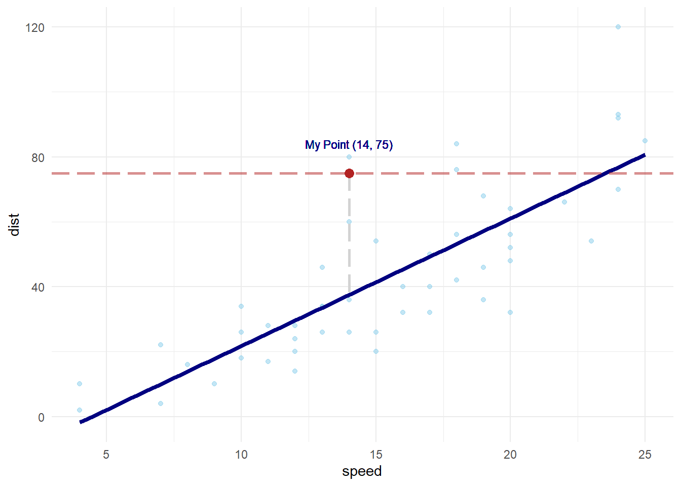
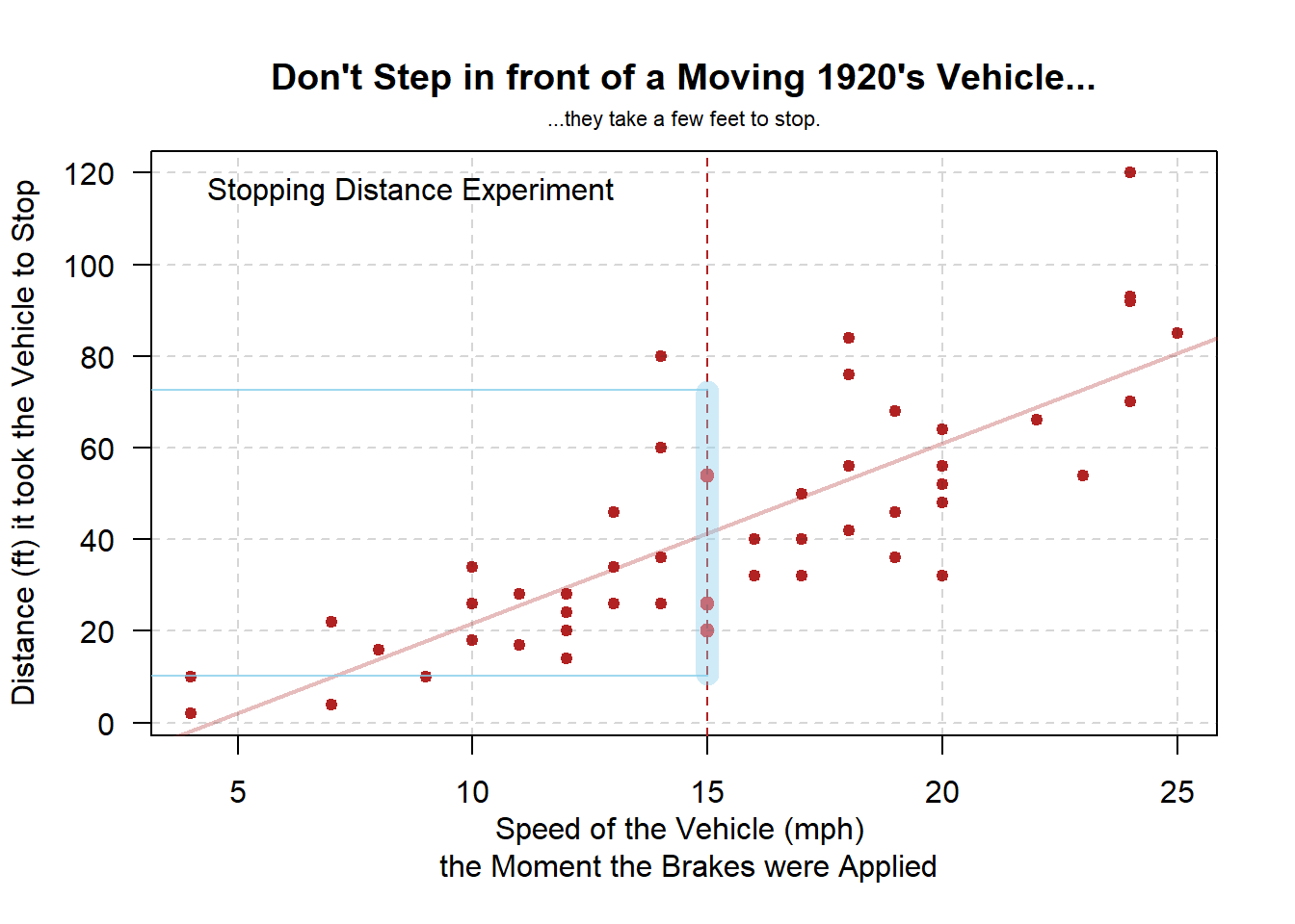
geom_hline( Use geom_hline() to add a horizontal line at a specified y-intercept. You can also use geom_vline(xintercept = some_number) to add a vertical line to the graph. yintercept = Use “yintercept =” to tell geom_hline() that you are going to declare a y intercept for the horizontal line. 75 75 is the value of the y-intercept. , color = “firebrick” Use color = “firebrick” to change the color of the horizontal line to firebrick red. , size = 1, Use size = 1 to adjust the thickness of the horizontal line to size 1.
linetype = “longdash” Use linetype = “longdash” to change the solid line to a dashed line with longer dashes. Some linetype options include “dashed”, “dotted”, “longdash”, “dotdash”, etc. , alpha = 0.5 Use alpha = 0.5 to change the transparency of the horizontal line to 0.5. ) Closing parenthesis of geom_hline function. + The + allows you to add more layers to the framework provided by ggplot().
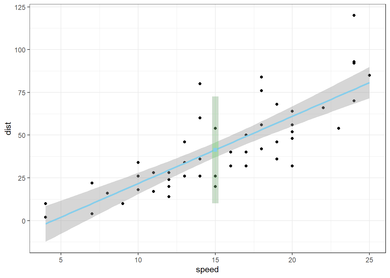
geom_segment( geom_segment() allows you to add a line segment to ggplot() by using specified start and end points. x = “x =” tells geom_segment() that you are going to declare the x-coordinate for the starting point of the line segment. 14, 14 is a number on the x-axis of your graph. It is the x-coordinate of the starting point of the line segment. y =
“y =” tells geom_segment() that you are going to declare the y-coordinate for the starting point of the line segment. 75, 75 is a number on the y-axis of your graph. It is the y-coordinate of the starting point of the line segment. xend = “xend =” tells geom_segment() that you are going to declare the x-coordinate for the end point of the line segment. 14, 14 is a number on the x-axis of your graph. It is the x-coordinate of the end point of the line segment. yend = “yend =” tells geom_segment() that you are going to declare the y-coordinate for the end point of the line segment. 38, 38 is a number on the y-axis of your graph. It is the y-coordinate of the end point of the line segment.
size = 1 Use size = 1 to adjust the thickness of the line segment. , color = “lightgray” Use color = “lightgray” to change the color of the line segment to light gray. , linetype = “longdash” Use *linetype = “longdash* to change the solid line segment to a dashed one. Some linetype options include”dashed“,”dotted“,”longdash“,”dotdash", etc. ) Closing parenthesis for geom_segment() function. + The + allows you to add more layers to the framework provided by ggplot().
geom_point( geom_point() can also be used to add individual points to the graph. Simply declare the x and y coordinates of the point you want to plot. x = “x =” tells geom_point() that you are going to declare the x-coordinate for the point. 14, 14 is a number on the x-axis of your graph. It is the x-coordinate of the point. y = “y =” tells geom_point() that you are going to declare the y-coordinate for the point. 75 75 is a number on the y-axis of your graph. It is the y-coordinate of the point. , size = 3 Use size = 3 to make the point stand out more. , color = “firebrick” Use color = “firebrick” to change the color of the point to firebrick red. ) Closing parenthesis of the geom_point() function. + The + allows you to add more layers to the framework provided by ggplot().
geom_text( geom_text() allows you to add customized text anywhere on the graph. It is very similar to the base R equivalent, text(…). x = “x =” tells geom_text() that you are going to declare the x-coordinate for the text. 14, 14 is a number on the x-axis of your graph. It is the x-coordinate of the text. y = “y =” tells geom_text() that you are going to declare the y-coordinate for the text. 84, 84 is a number on the y-axis of your graph. It is the y-coordinate of the text. label = “label =” tells geom_text() that you are going to give it the label. “My Point (14, 75)”, “My Point (14, 75)” is the text that will appear on the graph.
color = “navy” Use color = “navy” to change the color of the text to navy blue. , size = 3 Use size = 3 to change the size of the text. ) Closing parenthesis of the geom_text() function. + The + allows you to add more layers to the framework provided by ggplot().
theme_minimal() Add a minimalistic theme to the graph. There are many other themes that you can try out. Click to Show Output Click to View Output.
Accessing Parts of the Regression
Finally, note that the mylm object contains the names(mylm) of
mylm$coefficients Contains two values. The first is the estimated \(y\)-intercept. The second is the estimated slope.
mylm$residuals Contains the residuals from the regression in the same order as the actual dataset.
mylm$fitted.values The values of \(\hat{Y}\) in the same order as the original dataset.
mylm$… several other things that will not be explained here.
Making Predictions
predict( The R function predict(…) allows you to use an lm(…) object to make predictions for specified x-values. mylm, This is the name of a previously performed lm(…) that was saved into the name mylm <- lm(...). data.frame( To specify the values of \(x\) that you want to use in the prediction, you have to put those x-values into a data set, or more specifally, a data.frame(…). X= The value for X= should be whatever x-variable name was used in the original regression. For example, if mylm <- lm(dist ~ speed, data=cars) was the original regression, then this code would read speed = instead of X=… Further, the value of \(Xh\) should be some specific number, like speed=12 for example. Xh The value of \(Xh\) should be some specific number, like 12, as in speed=12 for example. ) Closing parenthesis for the data.frame(…) function. ) Closing parenthesis for the predict(…) function.
predict( The R function predict(…) allows you to use an lm(…) object to make predictions for specified x-values. mylm, This is the name of a previously performed lm(…) that was saved into the name mylm <- lm(...). data.frame( To specify the values of \(x\) that you want to use in the prediction, you have to put those x-values into a data set, or more specifally, a data.frame(…). X= The value for X= should be whatever x-variable name was used in the original regression. For example, if mylm <- lm(dist ~ speed, data=cars) was the original regression, then this code would read speed = instead of X=… Further, the value of \(Xh\) should be some specific number, like speed=12 for example. Xh The value of \(Xh\) should be some specific number, like 12, as in speed=12 for example. ), Closing parenthesis for the data.frame(…) function. interval= This optional command allows you to specify if the predicted value should be accompanied by either a confidence interval or a prediction interval. “prediction” This specifies that a prediction interval will be included with the predicted value. A prediction interval gives you a 95% confidence interval that captures 95% of the data, or \(Y_i\) values for the specific \(X\)-value specified in the prediction. ) Closing parenthesis of the predict(…) function.
predict( The R function predict(…) allows you to use an lm(…) object to make predictions for specified x-values. mylm, This is the name of a previously performed lm(…) that was saved into the name mylm <- lm(...). data.frame( To specify the values of \(x\) that you want to use in the prediction, you have to put those x-values into a data set, or more specifally, a data.frame(…). X= The value for X= should be whatever x-variable name was used in the original regression. For example, if mylm <- lm(dist ~ speed, data=cars) was the original regression, then this code would read speed = instead of X=… Further, the value of \(Xh\) should be some specific number, like speed=12 for example. Xh The value of \(Xh\) should be some specific number, like 12, as in speed=12 for example. ), Closing parenthesis for the data.frame(…) function. interval= This optional command allows you to specify if the predicted value should be accompanied by either a confidence interval or a prediction interval. “confidence” This specifies that a confidence interval for the prediction should be provided. This is of use whenever your interest is in just estimating the average y-value, not the actual y-values. ) Closing parenthesis of the predict(…) function.
Finding Confidence Intervals for Model Parameters
confint( The R function confint(…) allows you to use an lm(…) object to compute confidence intervals for one or more parameters (like \(\beta_0\) or \(\beta_1\)) in your model. mylm, This is the name of a previously performed lm(…) that was saved into the name mylm <- lm(...). level = “level =” tells the confint(…) function that you are going to declare at what level of confidence you want the interval. The default is “level = 0.95.” If you want to find 95% confidence intervals for your parameters, then just run confint(mylm). someConfidenceLevel someConfidenceLevel is simply a confidence level you choose when you want something other than a 95% confidence interval. Some examples of appropriate levels include 0.90 and 0.99. ) Closing parenthesis for confint(..) function.
Explanation
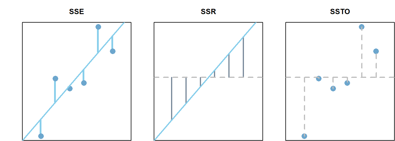
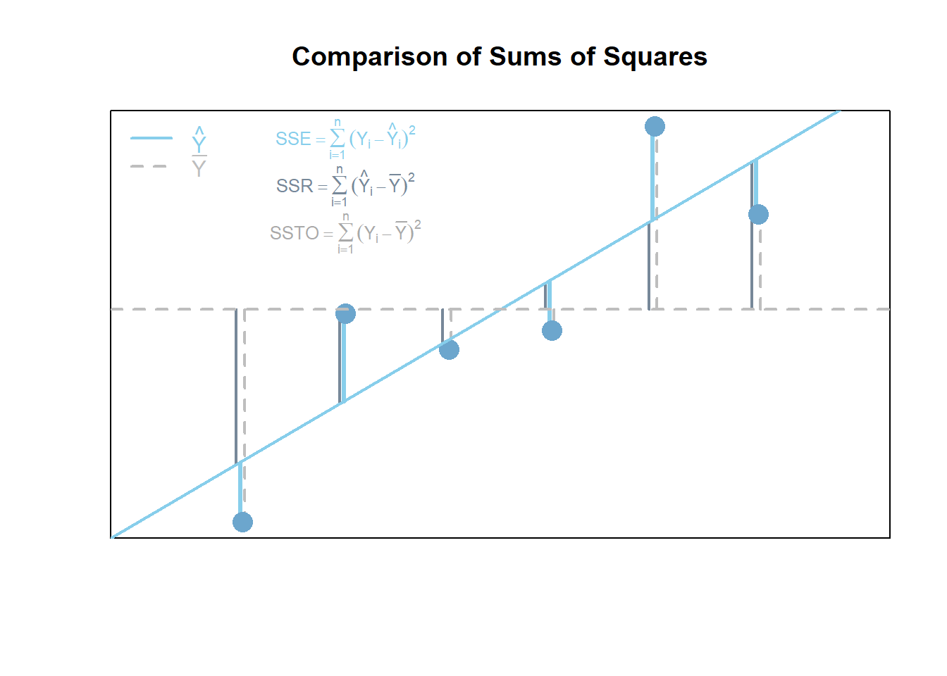
Linear regression has a rich mathematical theory behind it. This is because it uses a mathematical function and a random error term to describe the regression relation between a response variable \(Y\) and an explanatory variable called \(X\).
Expand each element below to learn more.
Regression Cheat Sheet (Expand)
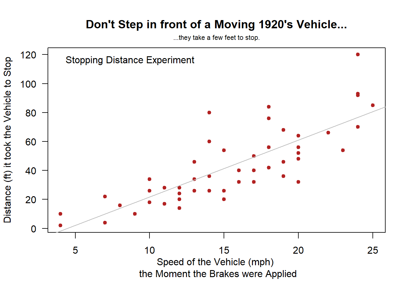
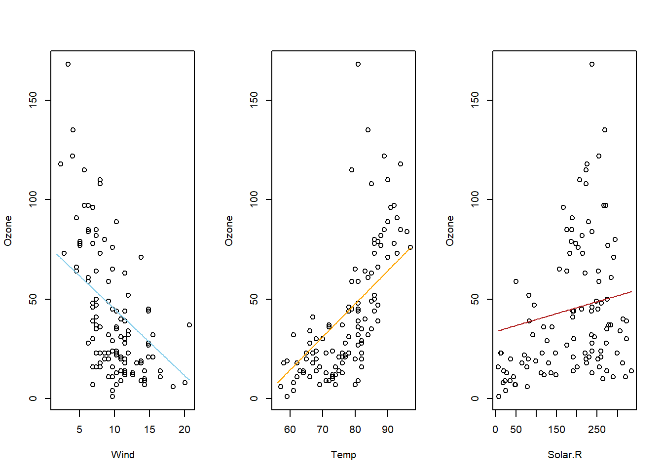
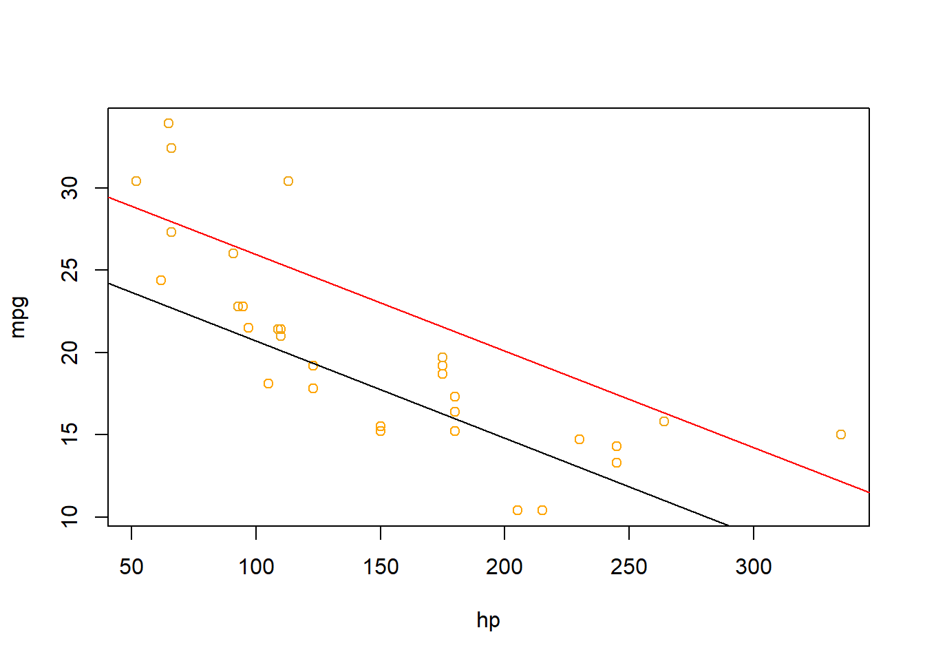
Examples: bodyweight, cars
Multiple Linear Regression
Multiple regression allows for more than one explanatory variable to be included in the modeling of the expected value of the quantitative response variable \(Y_i\). There are infinitely many possible multiple regression models to choose from. Here are a few “basic” models that work as building blocks to more complicated models.
Overview
Select a model to see interpretation details, an example, and R Code help.
|
|
\[ Y_i = \overbrace{\underbrace{\beta_0 + \beta_1 X_i}_{E\{Y_i\}}}^\text{Simple Model} + \epsilon_i \] |
The Simple Linear Regression model uses a single x-variable once: \(X_i\).
| Parameter | Effect |
|---|---|
| \(\beta_0\) | Y-intercept of the Model |
| \(\beta_1\) | Slope of the line |
|
|
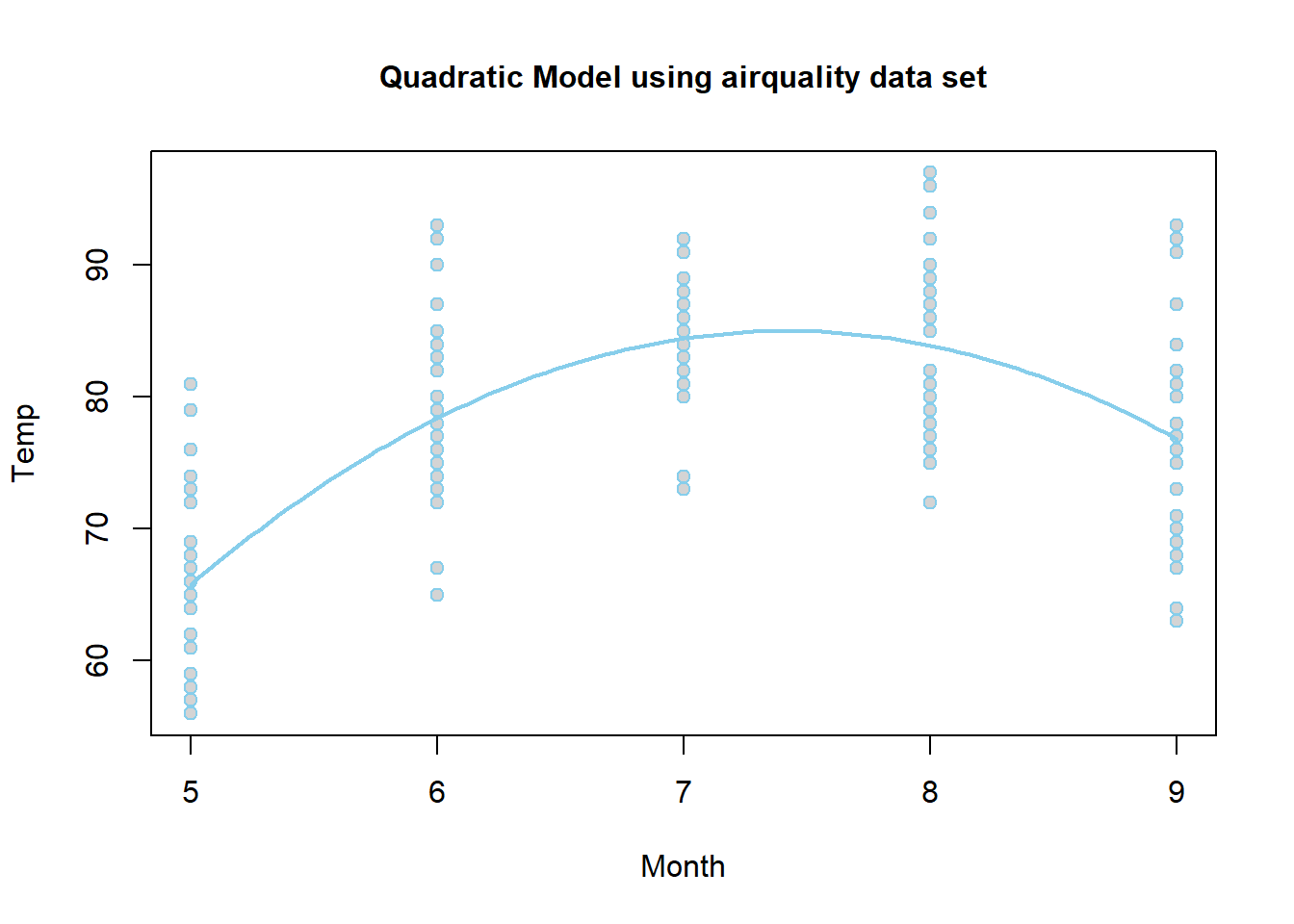
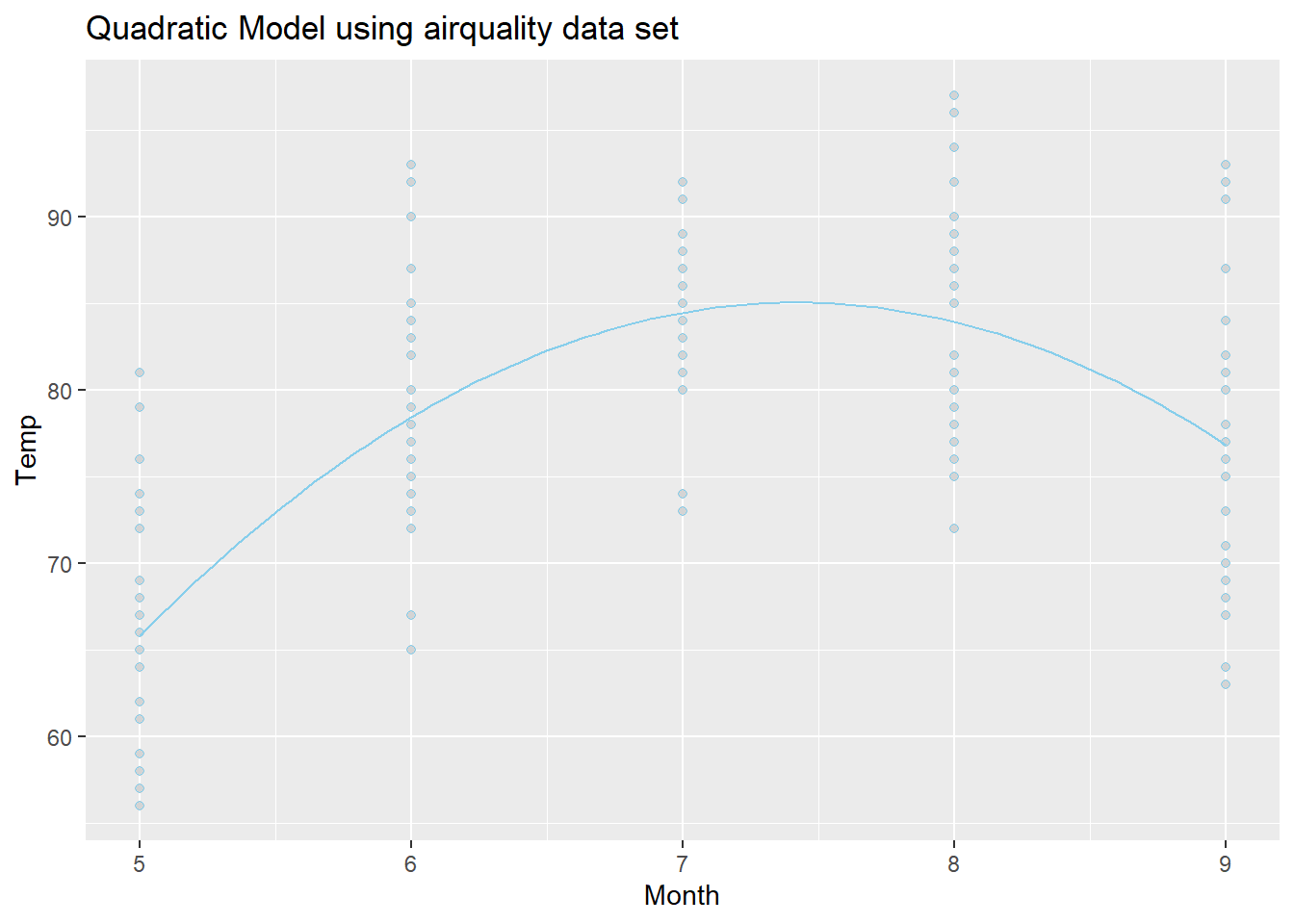
\[ Y_i = \overbrace{\underbrace{\beta_0 + \beta_1 X_i + \beta_2 X_i^2}_{E\{Y_i\}}}^\text{Quadratic Model} + \epsilon_i \] |
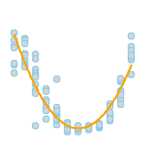
The Quadratic model uses the same \(X\)-variable twice, once with a \(\beta_1 X_i\) term and once with a \(\beta_2 X_i^2\) term. The \(X_i^2\) term is called the “quadratic” term.
| Parameter | Effect |
|---|---|
| \(\beta_0\) | Y-intercept of the Model. |
| \(\beta_1\) | Controls the x-position of the vertex of the parabola by \(\frac{-\beta_1}{2\cdot\beta_2}\). |
| \(\beta_2\) | Controls the concavity and “steepness” of the Model: negative values face down, positive values face up; large values imply “steeper” parabolas and low values imply “flatter” parabolas. Also involved in the position of the vertex, see \(\beta_1\)’s explanation. |
|
|
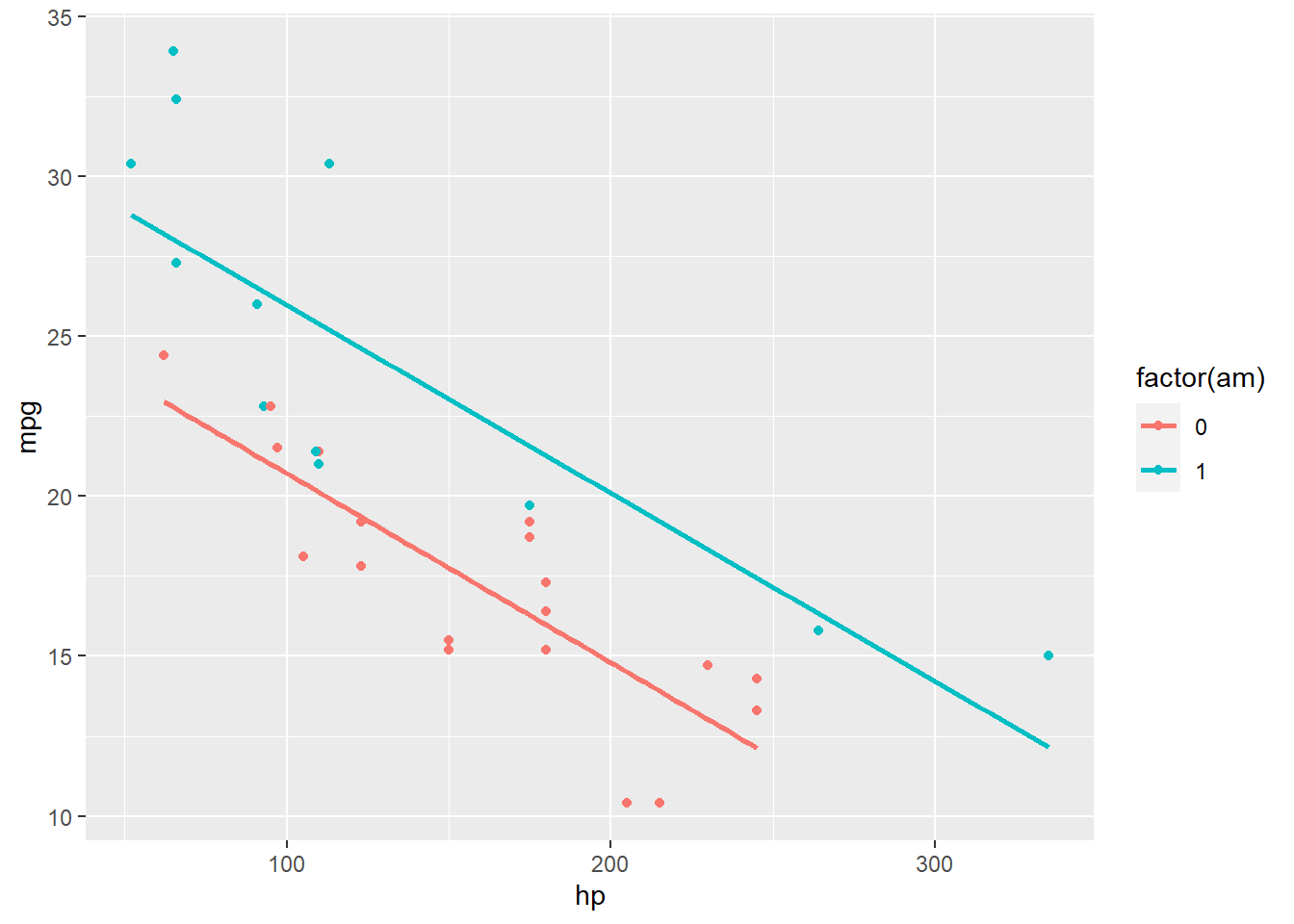
\[ Y_i = \overbrace{\underbrace{\beta_0 + \beta_1 X_{1i} + \beta_2 X_{2i} + \beta_3 X_{1i} X_{2i}}_{E\{Y_i\}}}^\text{Two-lines Model} + \epsilon_i \] \[ X_{2i} = \left\{\begin{array}{ll} 1, & \text{Group B} \\ 0, & \text{Group A} \end{array}\right. \] |
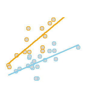
The so called “two-lines” model uses a quantitative \(X_{1i}\) variable and a 0,1 indicator variable \(X_{2i}\). It is a basic example of how a “dummy variable” or “indicator variable” can be used to turn qualitative variables into quantitative terms. In this case, the indicator variable \(X_{2i}\), which is either 0 or 1, produces two separate lines: one line for Group A, and one line for Group B.
| Parameter | Effect |
|---|---|
| \(\beta_0\) | Y-intercept of the Model. |
| \(\beta_1\) | Controls the slope of the “base-line” of the model, the “Group 0” line. |
| \(\beta_2\) | Controls the change in y-intercept for the second line in the model as compared to the y-intercept of the “base-line” line. |
| \(\beta_3\) | Called the “interaction” term. Controls the change in the slope for the second line in the model as compared to the slope of the “base-line” line. |
|
|
\[ Y_i = \overbrace{\underbrace{\beta_0 + \beta_1 X_{1i} + \beta_2 X_{2i} + \beta_3 X_{1i}X_{2i}}_{E\{Y_i\}}}^\text{3D Model} + \epsilon_i \] |
The so called “3D” regression model uses two different quantitative x-variables, an \(X_{1i}\) and an \(X_{2i}\). Unlike the two-lines model where \(X_{2i}\) could only be a 0 or a 1, this \(X_{2i}\) variable is quantitative, and can take on any quantitative value.
| Parameter | Effect |
|---|---|
| \(\beta_0\) | Y-intercept of the Model |
| \(\beta_1\) | Slope of the line in the \(X_1\) direction. |
| \(\beta_2\) | Slope of the line in the \(X_2\) direction. |
| \(\beta_3\) | Interaction term that allows the model, which is a plane in three-dimensional space, to “bend”. If this term is zero, then the regression surface is just a flat plane. |

The coefficient \(\beta_j\) is interpreted as the change in the expected value of \(Y\) for a unit increase in \(X_{j}\), holding all other variables constant, for \(j=1,\ldots,p-1\).
See the Explanation tab for details about possible hypotheses here.
R Instructions
NOTE: These are general R Commands for all types of multiple linear regressions. See the “Overview” section for R Commands details about a specific multiple linear regression model.
Console Help Command: ?lm()
Finding Variables
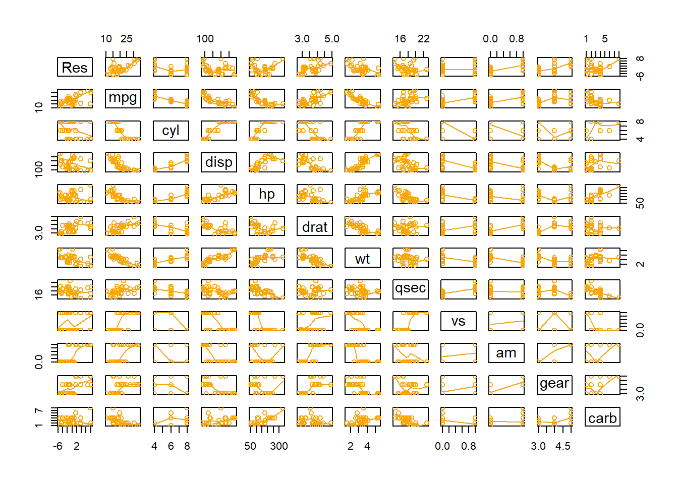
pairs( EXPLANATION. cbind( EXPLANATION. Res = EXPLANATION. mylm$ EXPLANATION. residuals, EXPLANATION. YourDataSet), EXPLANATION. panel = EXPLANATION. panel.smooth, EXPLANATION. col = EXPLANATION. as.factor( EXPLANATION. YourDataSet$ EXPLANATION. X)) EXPLANATION.
Perform the Regression
Everything is the same as in simple linear regression except that more variables are allowed in the call to lm().
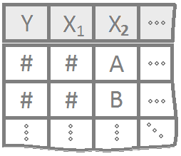
mylm <- lm( mylm is some name you come up with to store the results of the lm() test. Note that lm() stands for “linear model.” Y Y must be a “numeric” vector of the quantitative response variable. ~ EXPLANATION. X1 + X2 X1 and X2 are the explanatory variables. These can either be quantitative or qualitative. Note that R treats “numeric” variables as quantitative and “character” or “factor” variables as qualitative. R will automatcially recode qualitative variables to become “numeric” variables using a 0,1 encoding. See the Explanation tab for details. + X1:X2 X1:X2 is called the interaction term. See the Explanation tab for details. + …, * ... emphasizes that as many explanatory variables as are desired can be included in the model. data = YourDataSet) YourDataSet is the name of your data set.
summary( EXPLANATION. mylm EXPLANATION. ) Closing parenthesis for summary(…) function.
Plotting the Regression Lines
To add two regression lines to a scatterplot use two abline(...) commands:
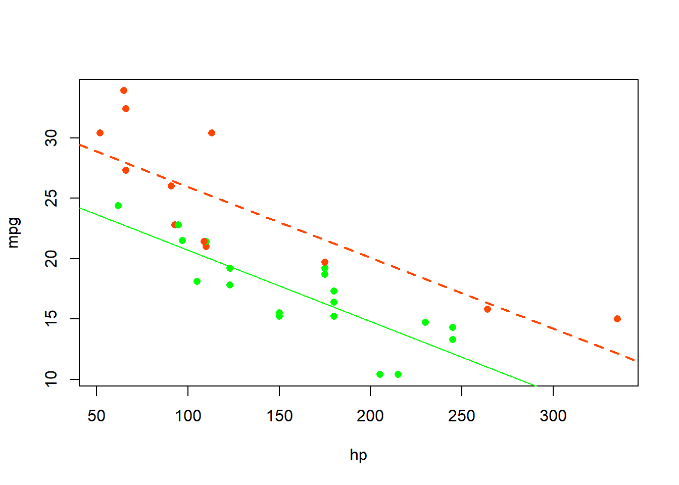
plot( EXPLANATION. Y EXPLANATION. ~ EXPLANATION. \(X_1\), EXPLANATION. col = EXPLANATION. as.factor( EXPLANATION. \(X_2\)), EXPLANATION. data = YourDataSet) EXPLANATION.
b EXPLANATION. <- EXPLANATION. mylm EXPLANATION. $ EXPLANATION. coefficients EXPLANATION.
abline( EXPLANATION. b[1], EXPLANATION. b[2]) EXPLANATION.
abline( EXPLANATION. (b[1]+ EXPLANATION. b[3]), EXPLANATION. (b[2]+ EXPLANATION. b[4]), EXPLANATION. col = EXPLANATION. “red”) EXPLANATION.
Customize the look:
b EXPLANATION. <- EXPLANATION. mylm EXPLANATION. $ EXPLANATION. coefficients EXPLANATION.
palette( EXPLANATION. c( EXPLANATION. “SomeColor”, EXPLANATION. “DifferentColor”)) EXPLANATION.
plot( EXPLANATION. Y EXPLANATION. ~ EXPLANATION. \(X_1\), EXPLANATION. col = EXPLANATION. as.factor( EXPLANATION. \(X_2\)), EXPLANATION. data = YourDataSet, EXPLANATION. pch = 16) EXPLANATION.
abline( EXPLANATION. b[1], EXPLANATION. b[2], EXPLANATION. col = palette()[1], EXPLANATION. lty = 1, EXPLANATION. lwd = 1) EXPLANATION.
abline( EXPLANATION. (b[1]+ EXPLANATION. b[3]), EXPLANATION. (b[2]+ EXPLANATION. b[4]), EXPLANATION. col = palette()[2], EXPLANATION. lty = 2, EXPLANATION. lwd = 2) EXPLANATION.
Making Predictions
predict( The R function predict(…) allows you to use an lm(…) object to make predictions for specified x-values. mylm, This is the name of a previously performed lm(…) that was saved into the name mylm <- lm(...). newdata = data.frame( To specify the values of \(x\) that you want to use in the prediction, you have to put those x-values into a data set, or more specifally, a data.frame(…). \(X_1\)= The value for X= should be whatever x-variable name was used in the original regression. For example, if mylm <- lm(mpg ~ hp + am + hp:am, data=mtcars) was the original regression, then this code would read hp = instead of X1 =… Further, the value of \(X_{1h}\) should be some specific number, like hp=123 for example. \(X_{1h}\), The value of \(X_{1h}\) should be some specific number, like 123, as in hp=123 for example. \(X_2\)= This is the value of the second x-variable, say am. \(X_{2h}\)) Since the am column can only be a 1 or 0, we would try am=1 for example, or am=0. ) Closing parenthesis.
predict( The R function predict(…) allows you to use an lm(…) object to make predictions for specified x-values. mylm, This is the name of a previously performed lm(…) that was saved into the name mylm <- lm(...). data.frame( To specify the values of \(x\) that you want to use in the prediction, you have to put those x-values into a data set, or more specifally, a data.frame(…). \(X_1\)= The value for X= should be whatever x-variable name was used in the original regression. For example, if mylm <- lm(dist ~ speed, data=cars) was the original regression, then this code would read speed = instead of X=… Further, the value of \(Xh\) should be some specific number, like speed=12 for example. \(X_1\)h, The value of \(Xh\) should be some specific number, like 12, as in speed=12 for example. \(X_2\)= EXPLANATION. \(X_2\)h), EXPLANATION. interval = “prediction”) EXPLANATION.
predict( The R function predict(…) allows you to use an lm(…) object to make predictions for specified x-values. mylm, This is the name of a previously performed lm(…) that was saved into the name mylm <- lm(...). data.frame( To specify the values of \(x\) that you want to use in the prediction, you have to put those x-values into a data set, or more specifally, a data.frame(…). \(X_1\)= The value for X= should be whatever x-variable name was used in the original regression. For example, if mylm <- lm(dist ~ speed, data=cars) was the original regression, then this code would read speed = instead of X=… Further, the value of \(Xh\) should be some specific number, like speed=12 for example. \(X_1\)h, The value of \(Xh\) should be some specific number, like 12, as in speed=12 for example. \(X_2\)= EXPLANATION. \(X_2\)h), EXPLANATION. interval = “confidence”) EXPLANATION.
Explanation
Class Examples
Now let’s apply your knowledge to three different pictures from three different, but similar models.
Use the starter code in each example.
palette(c("skyblue","firebrick"))

plot(mpg ~ qsec, data=mtcars, col=as.factor(am), xlim=c(0,30), ylim=c(-30,40), main="1974 Motor Trend Cars", pch=16)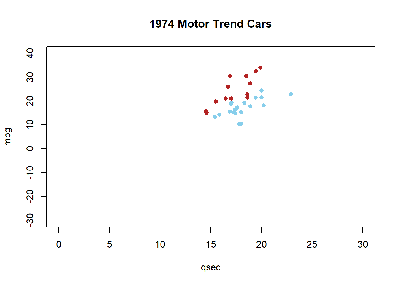
Problem 1: Equal Slopes Model
(different intercepts)
##
## Call:
## lm(formula = mpg ~ qsec + am, data = mtcars)
##
## Residuals:
##     Min      1Q  Median      3Q     Max
## -6.3447 -2.7699  0.2938  2.0947  6.9194
##
## Coefficients:
##             Estimate Std. Error t value Pr(>|t|)
## (Intercept) -18.8893     6.5970  -2.863  0.00771 **
## qsec          1.9819     0.3601   5.503 6.27e-06 ***
## am            8.8763     1.2897   6.883 1.46e-07 ***
## ---
## Signif. codes:  0 '***' 0.001 '**' 0.01 '*' 0.05 '.' 0.1 ' ' 1
##
## Residual standard error: 3.487 on 29 degrees of freedom
## Multiple R-squared:  0.6868, Adjusted R-squared:  0.6652
## F-statistic: 31.8 on 2 and 29 DF, p-value: 4.882e-08plot(mpg ~ qsec, data=mtcars, col=as.factor(am), xlim=c(0,30), ylim=c(-30,40), main="1974 Motor Trend Cars", pch=16)
abline(-18.8893, 1.9819, col=palette()[1])
abline(-18.8893+8.8763, 1.9819, col=palette()[2])
legend("topleft", legend=c("automatic","manual"), pch=1, col=palette(), title="Transmission (am)", bty="n")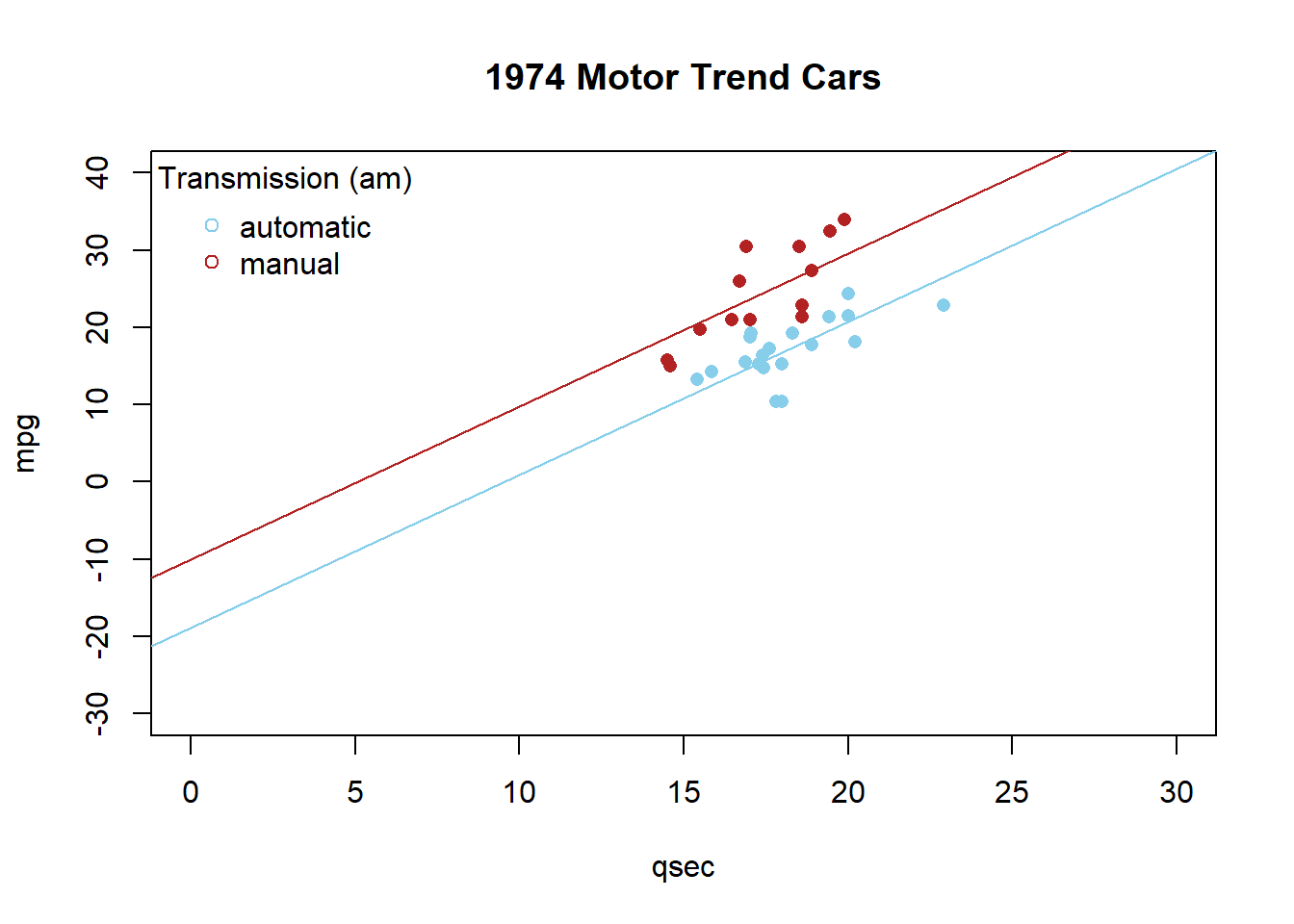
Problem 2: Equal Intercepts Model
(different slopes)
##
## Call:
## lm(formula = mpg ~ qsec + qsec:am, data = mtcars)
##
## Residuals:
##     Min      1Q  Median      3Q     Max
## -6.3306 -2.2453  0.1917  2.3112  6.9815
##
## Coefficients:
##              Estimate Std. Error t value Pr(>|t|)
## (Intercept) -15.30050    6.22260  -2.459   0.0201 *
## qsec          1.78149    0.34186   5.211 1.41e-05 ***
## qsec:am       0.50958    0.06994   7.286 5.04e-08 ***
## ---
## Signif. codes:  0 '***' 0.001 '**' 0.01 '*' 0.05 '.' 0.1 ' ' 1
##
## Residual standard error: 3.364 on 29 degrees of freedom
## Multiple R-squared:  0.7086, Adjusted R-squared:  0.6885
## F-statistic: 35.26 on 2 and 29 DF, p-value: 1.716e-08plot(mpg ~ qsec, data=mtcars, col=as.factor(am), xlim=c(0,30), ylim=c(-30,40), main="1974 Motor Trend Cars", pch=16)
abline(-15.30050, 1.78149, col=palette()[1])
abline(-15.30050, 1.78149+0.50958, col=palette()[2])
legend("topleft", legend=c("automatic","manual"), pch=1, col=palette(), title="Transmission (am)", bty="n")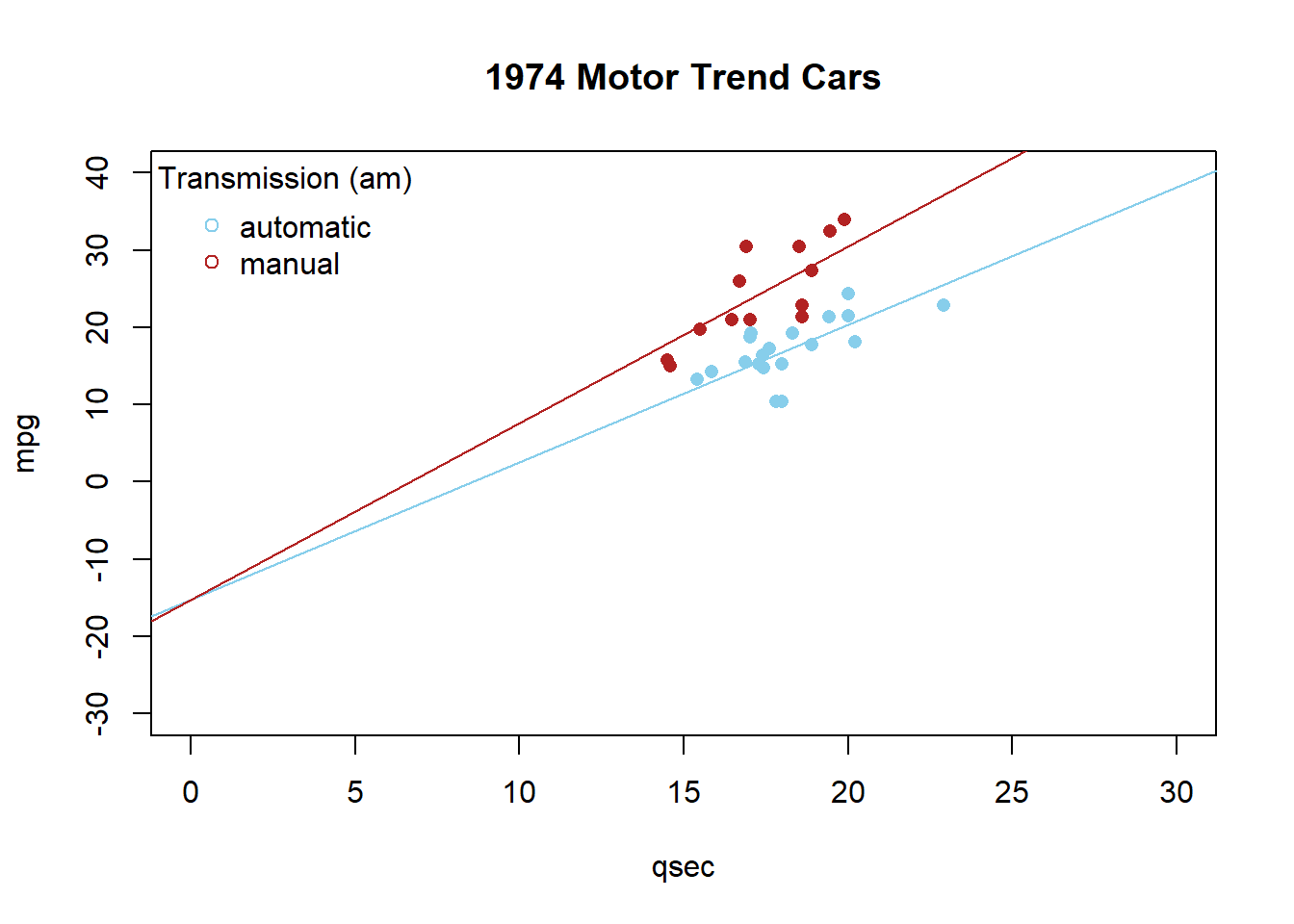
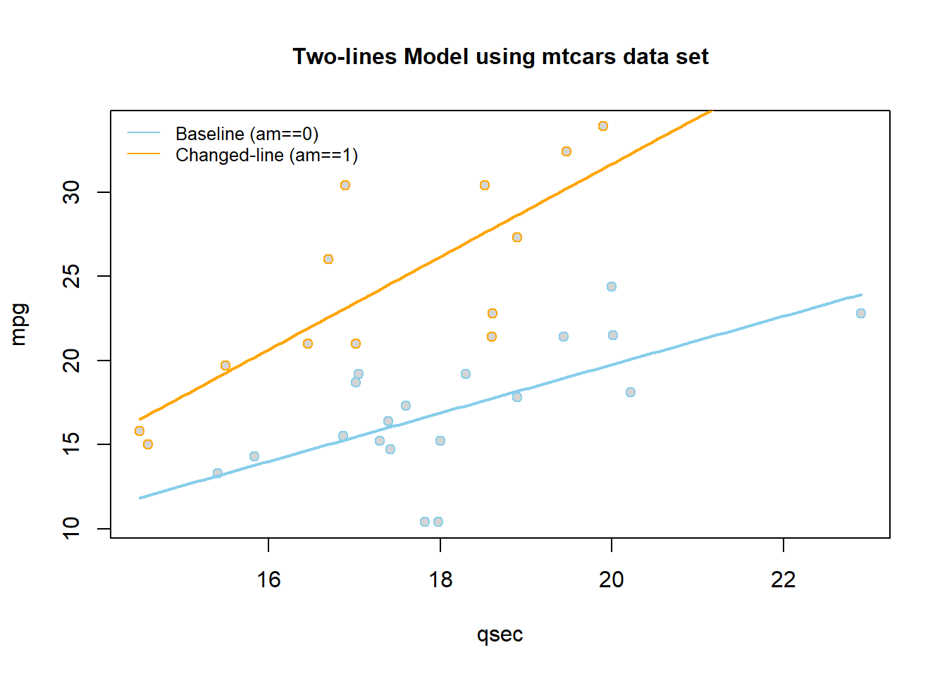
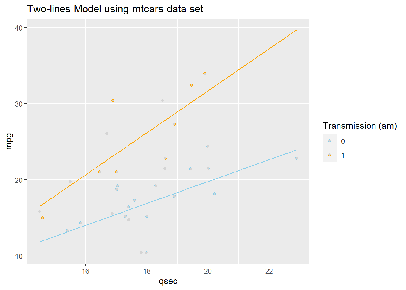
Problem 3: Full Model
(different slopes & different intercepts)
##
## Call:
## lm(formula = mpg ~ qsec + am + qsec:am, data = mtcars)
##
## Residuals:
##     Min      1Q  Median      3Q     Max
## -6.4551 -1.4331  0.1918  2.2493  7.2773
##
## Coefficients:
##             Estimate Std. Error t value Pr(>|t|)
## (Intercept)  -9.0099     8.2179  -1.096  0.28226
## qsec          1.4385     0.4500   3.197  0.00343 **
## am          -14.5107    12.4812  -1.163  0.25481
## qsec:am       1.3214     0.7017   1.883  0.07012 .
## ---
## Signif. codes:  0 '***' 0.001 '**' 0.01 '*' 0.05 '.' 0.1 ' ' 1
##
## Residual standard error: 3.343 on 28 degrees of freedom
## Multiple R-squared:  0.722,  Adjusted R-squared:  0.6923
## F-statistic: 24.24 on 3 and 28 DF, p-value: 6.129e-08plot(mpg ~ qsec, data=mtcars, col=as.factor(am), xlim=c(0,30), ylim=c(-30,40), main="1974 Motor Trend Cars", pch=16)
abline(-9.0099, 1.4385, col=palette()[1])
abline(-9.0099 -14.5107, 1.4385 + 1.3214, col=palette()[2])
legend("topleft", legend=c("automatic","manual"), pch=1, col=palette(), title="Transmission (am)", bty="n")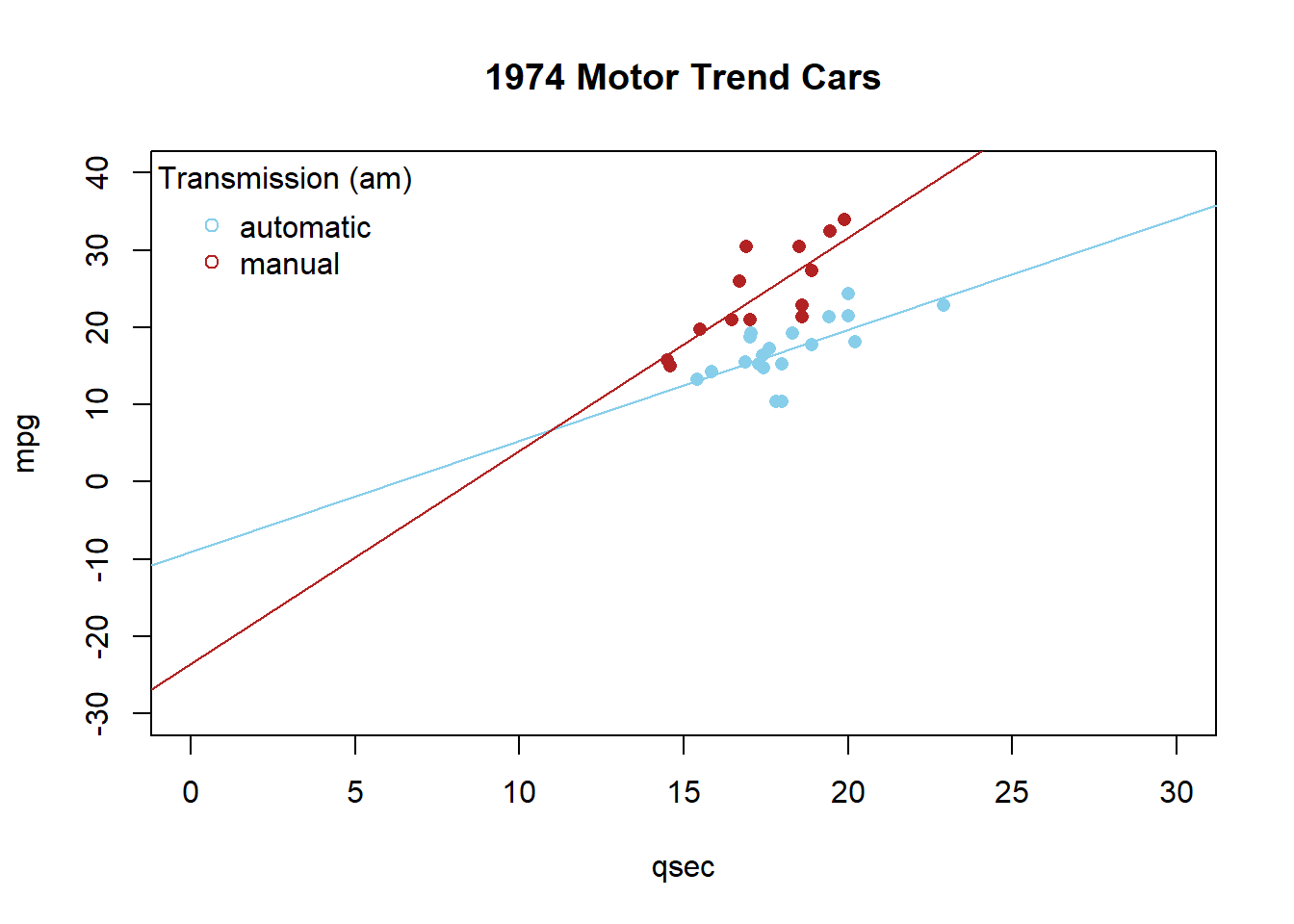
Examples: Civic Vs Corolla cadillacs